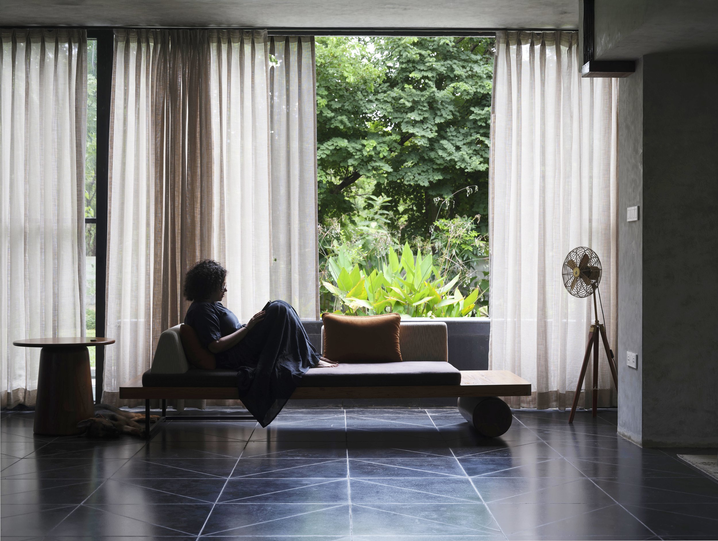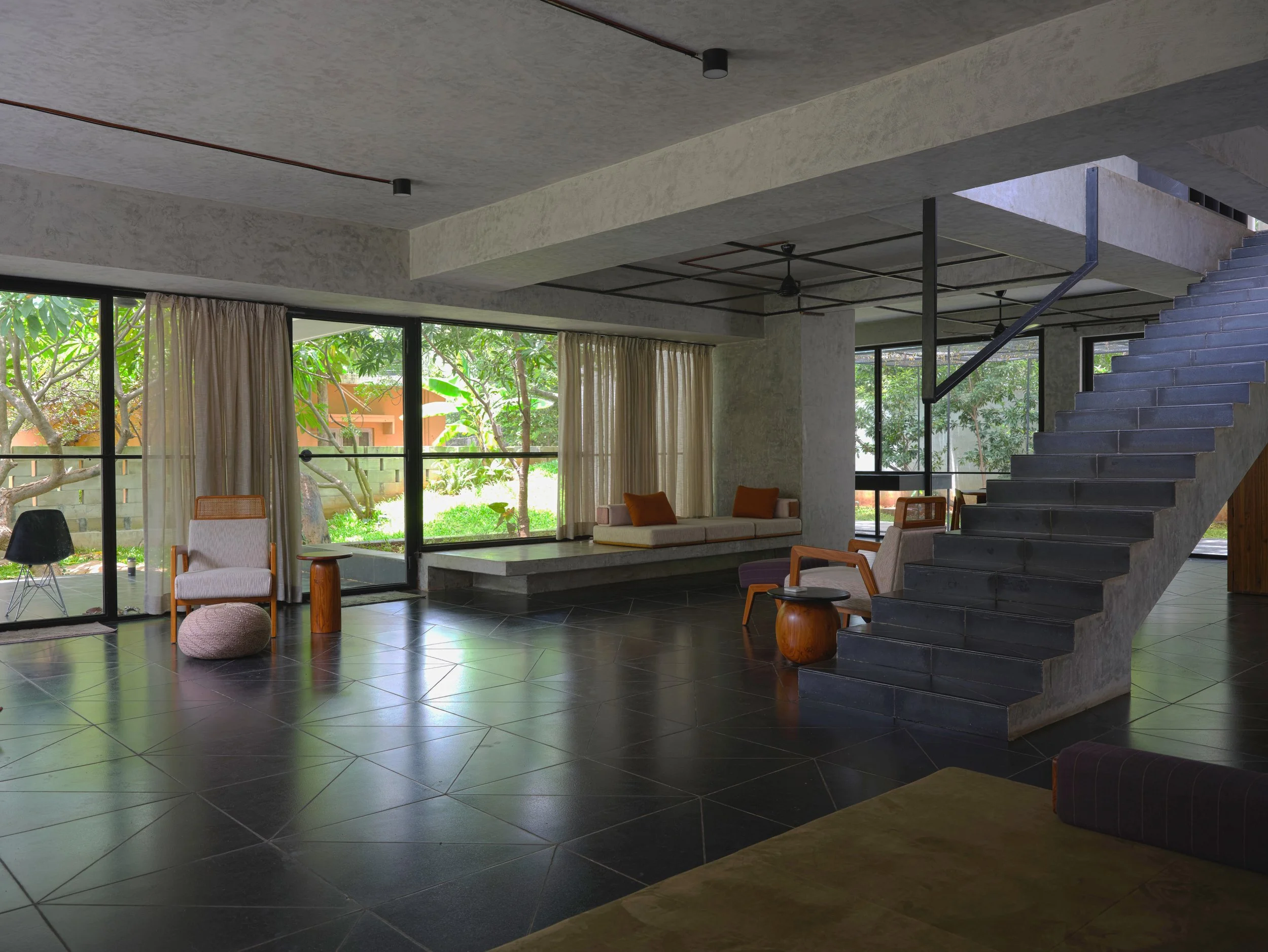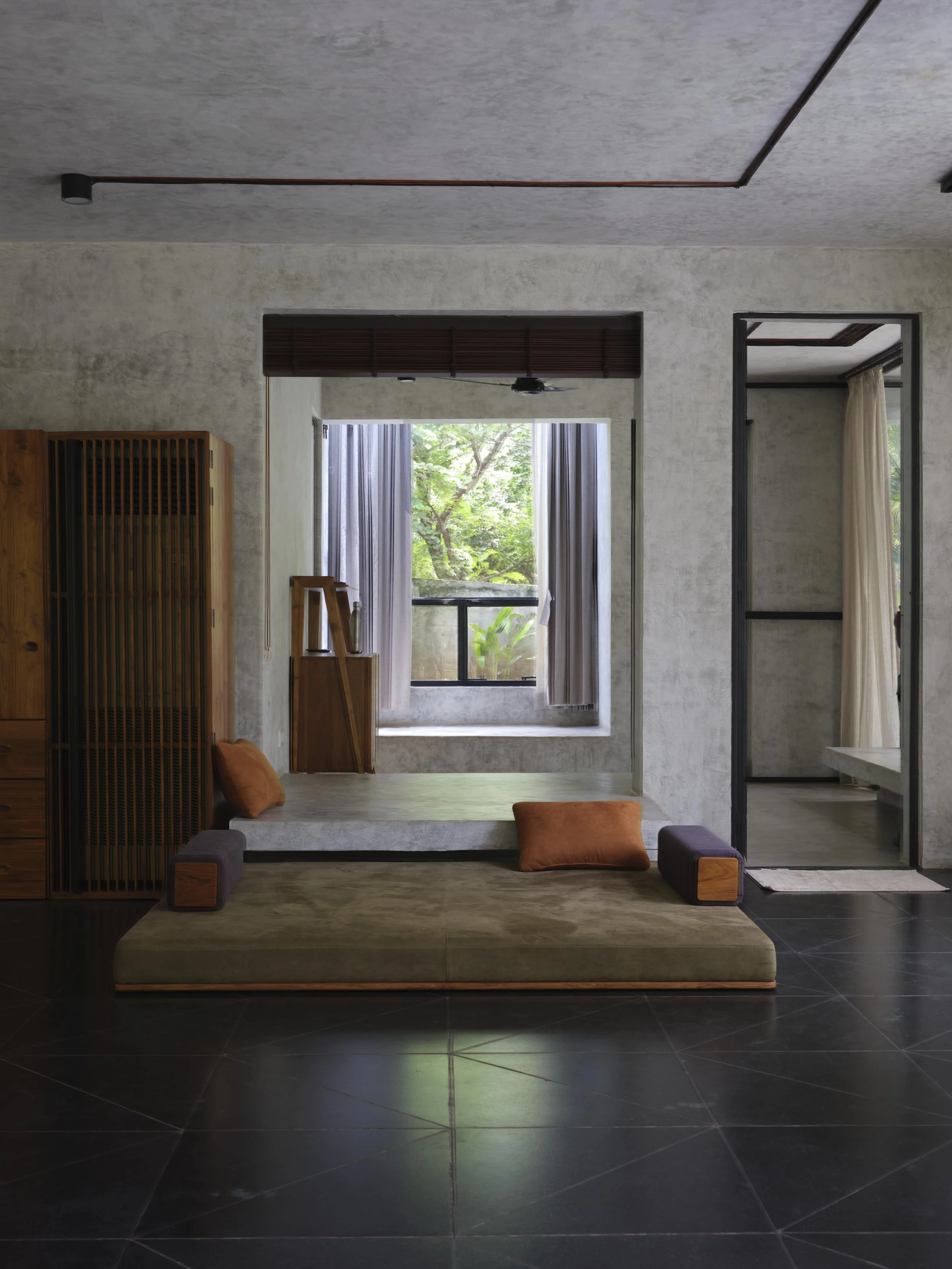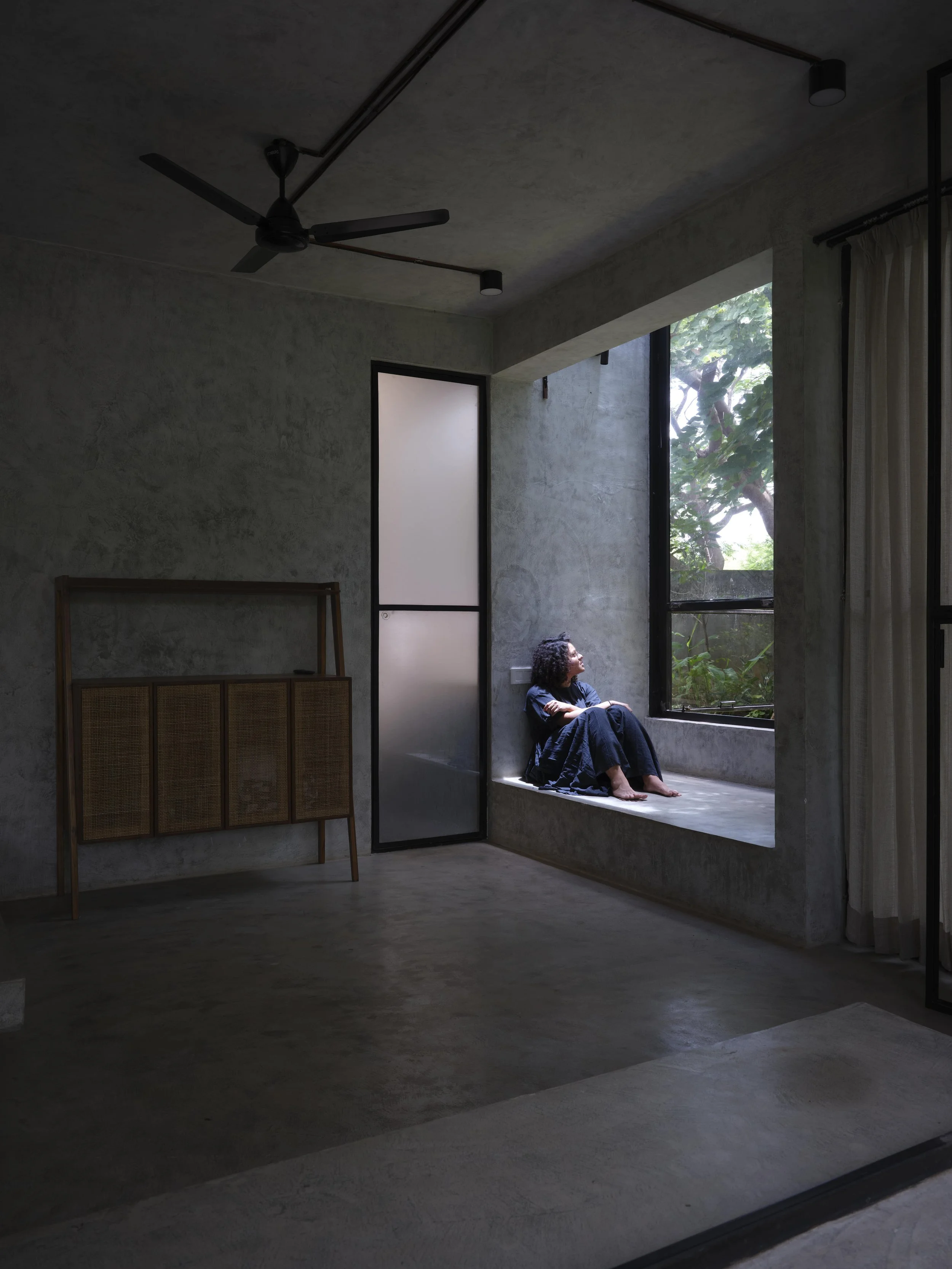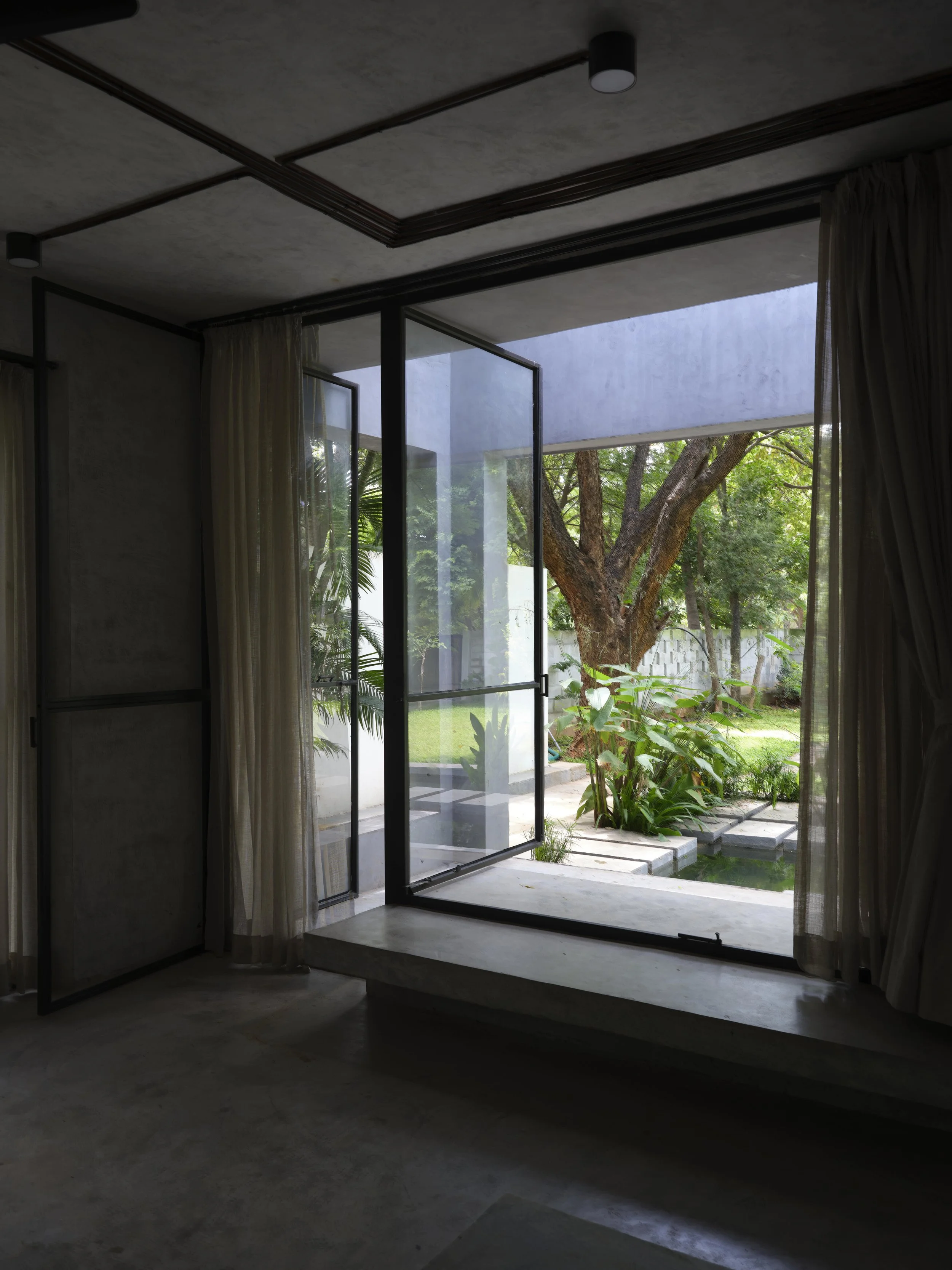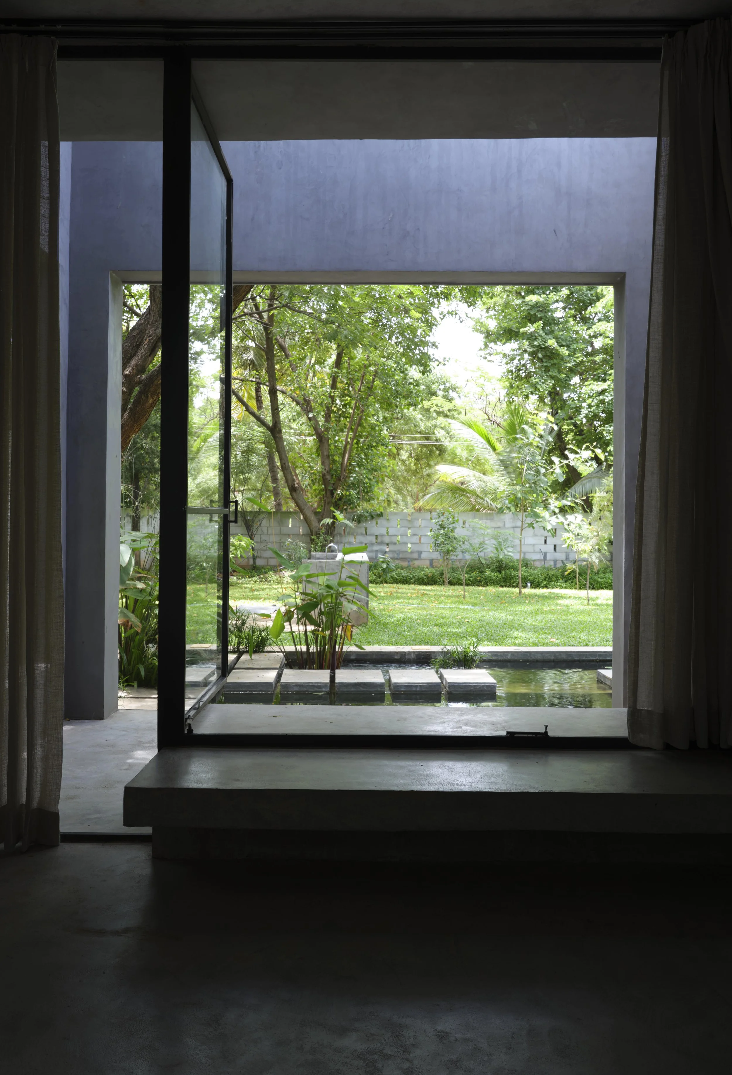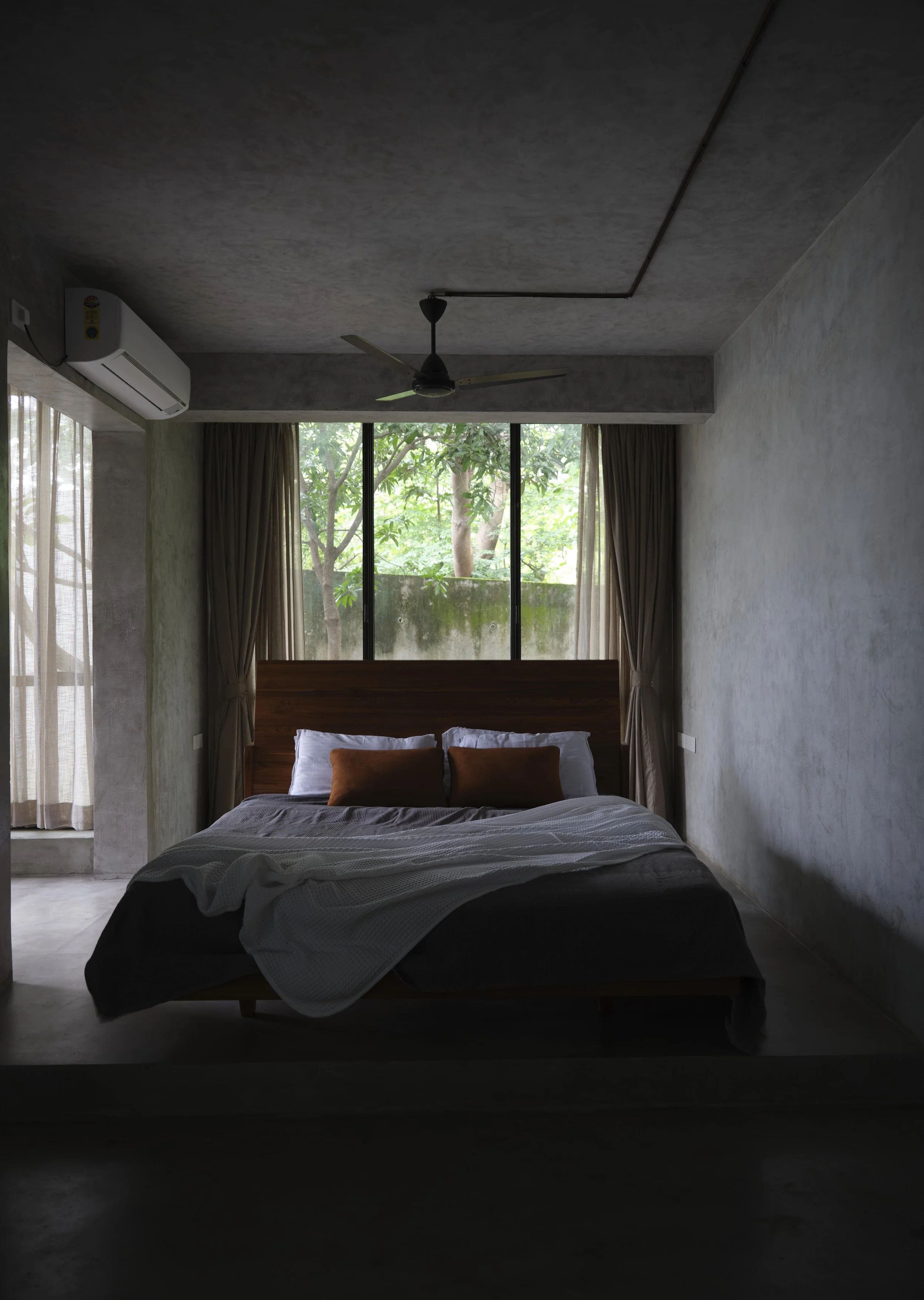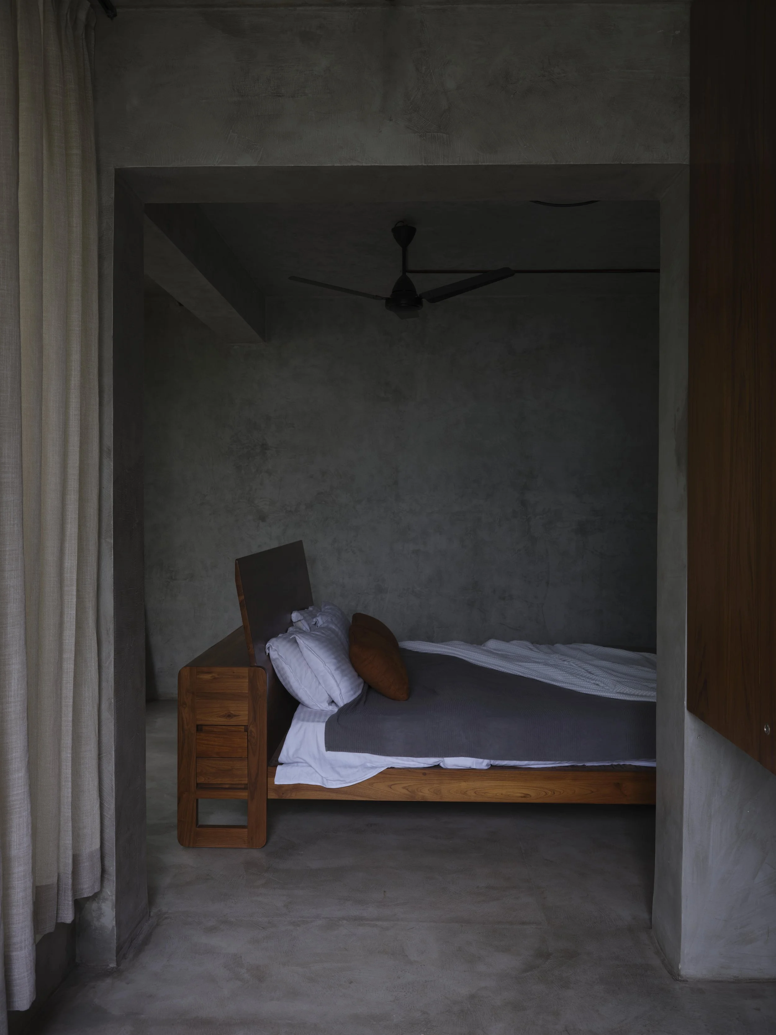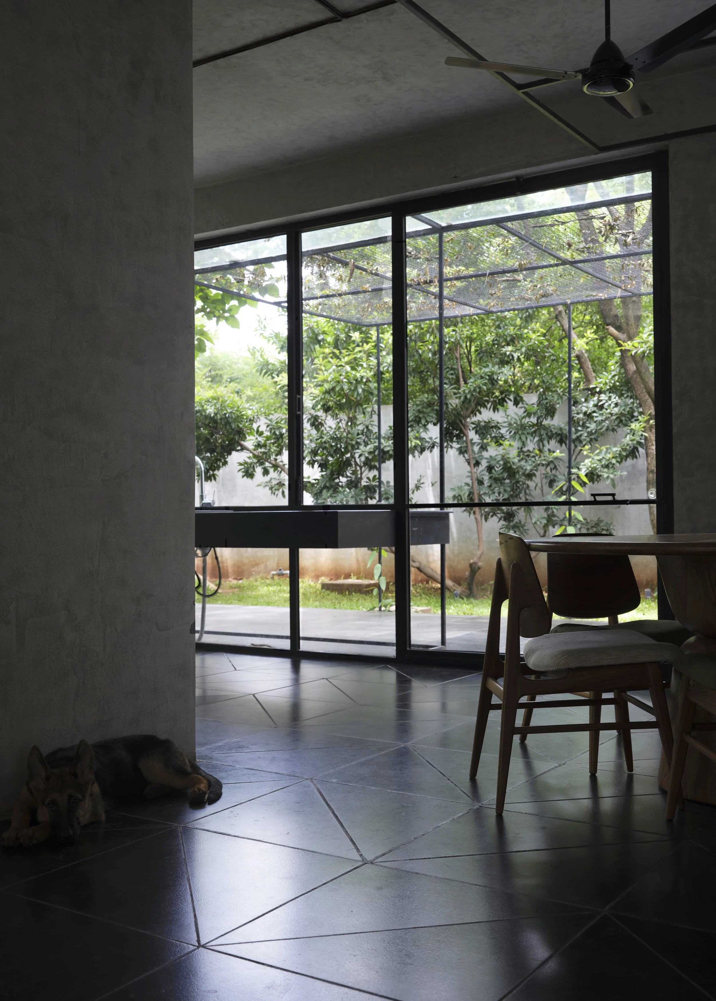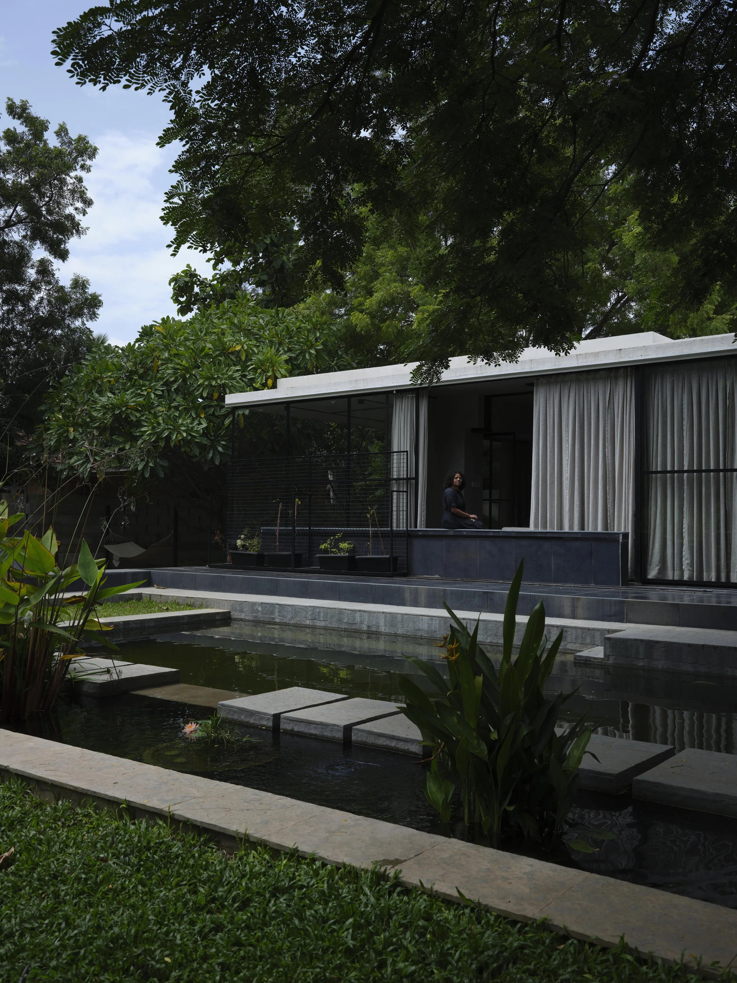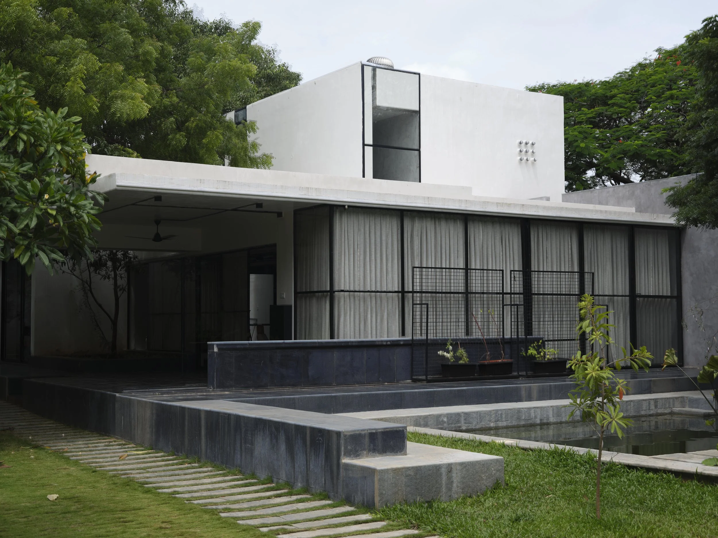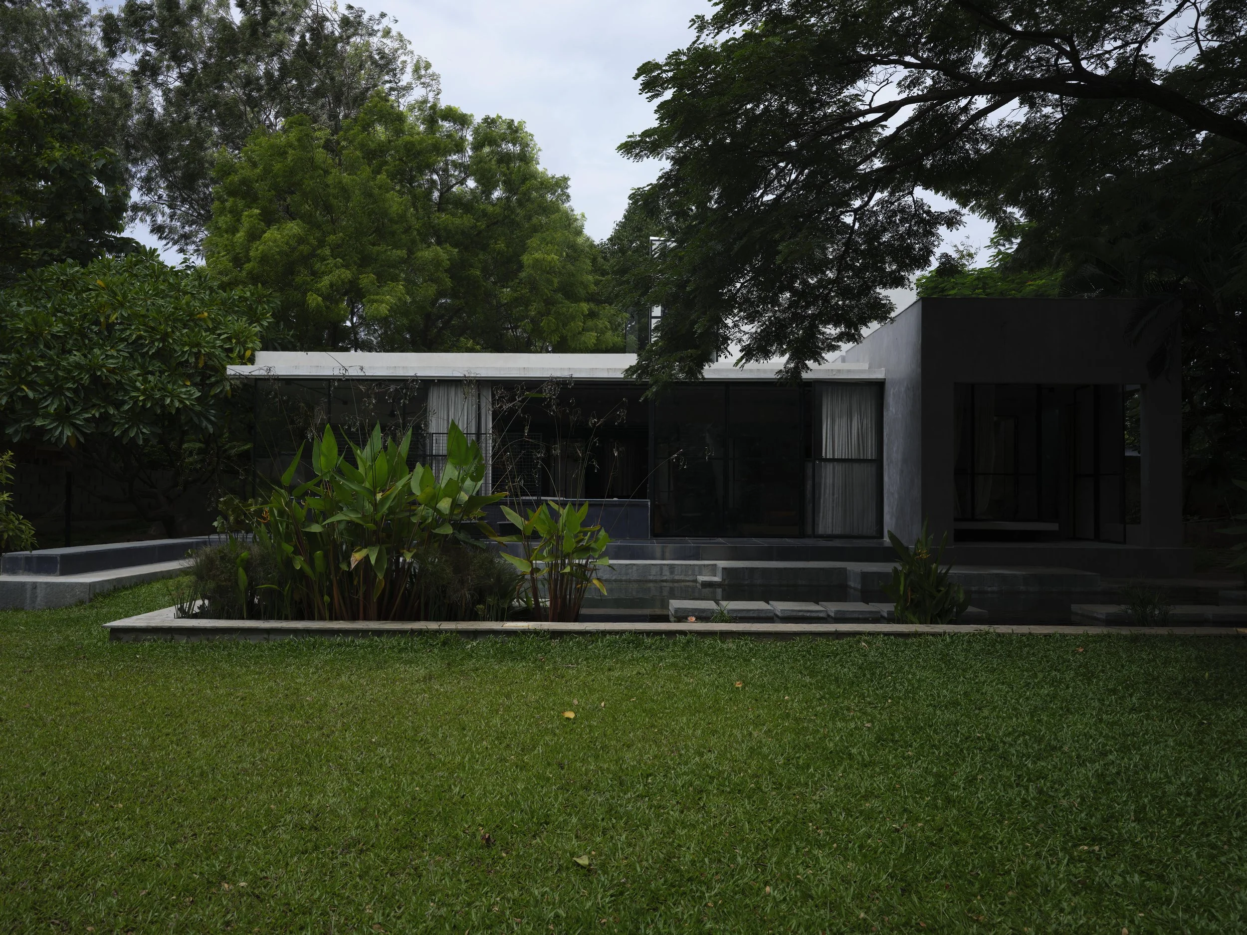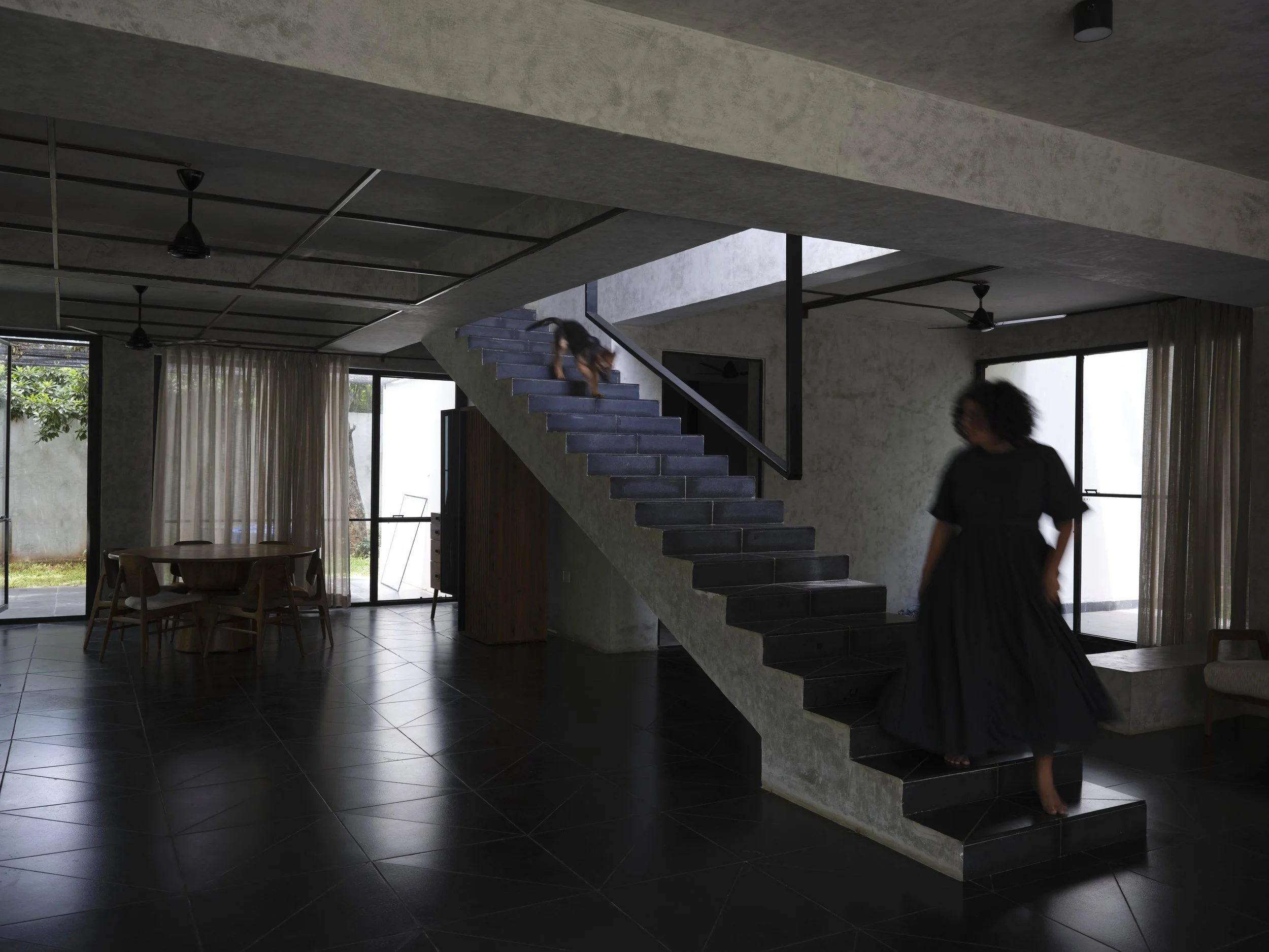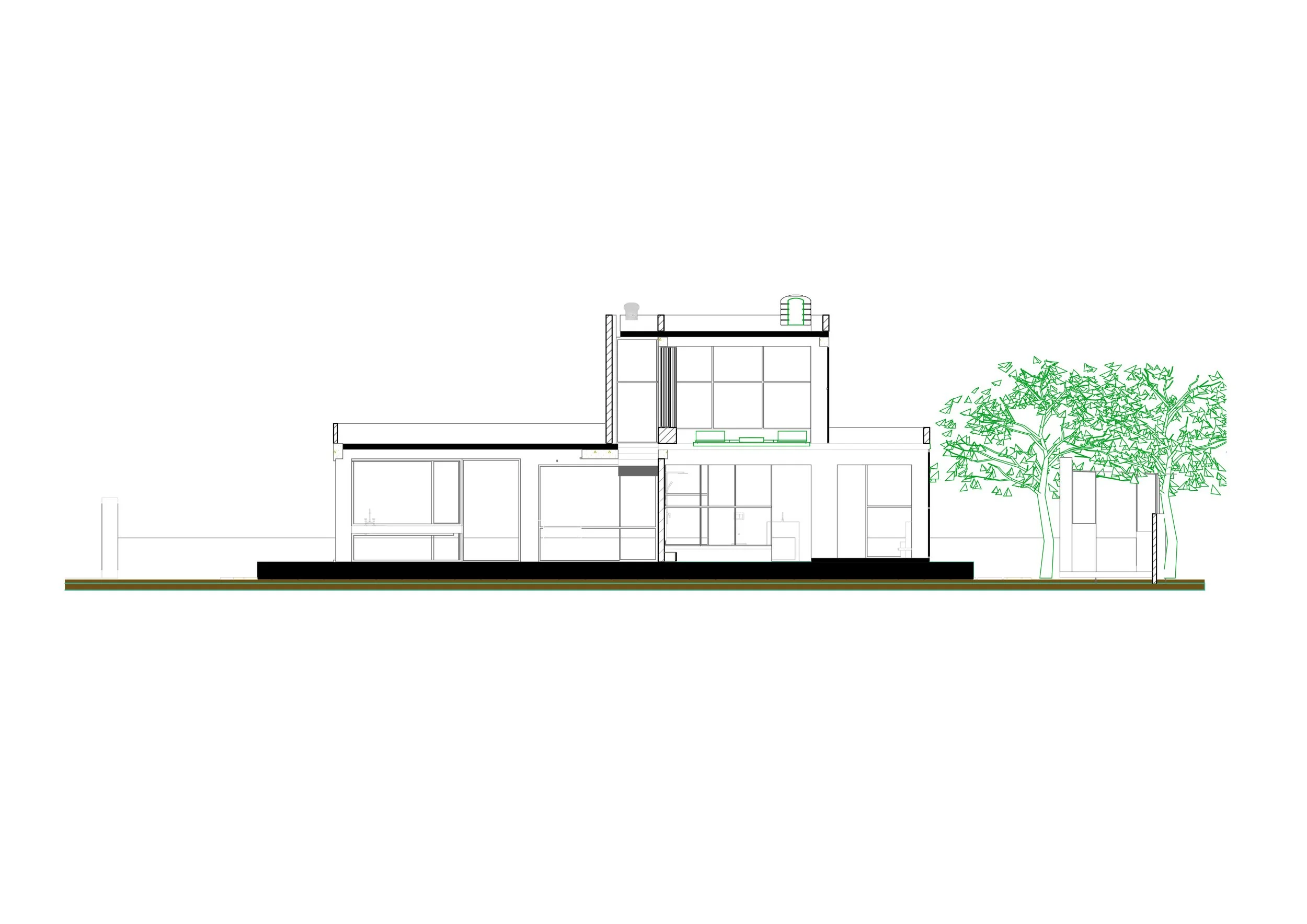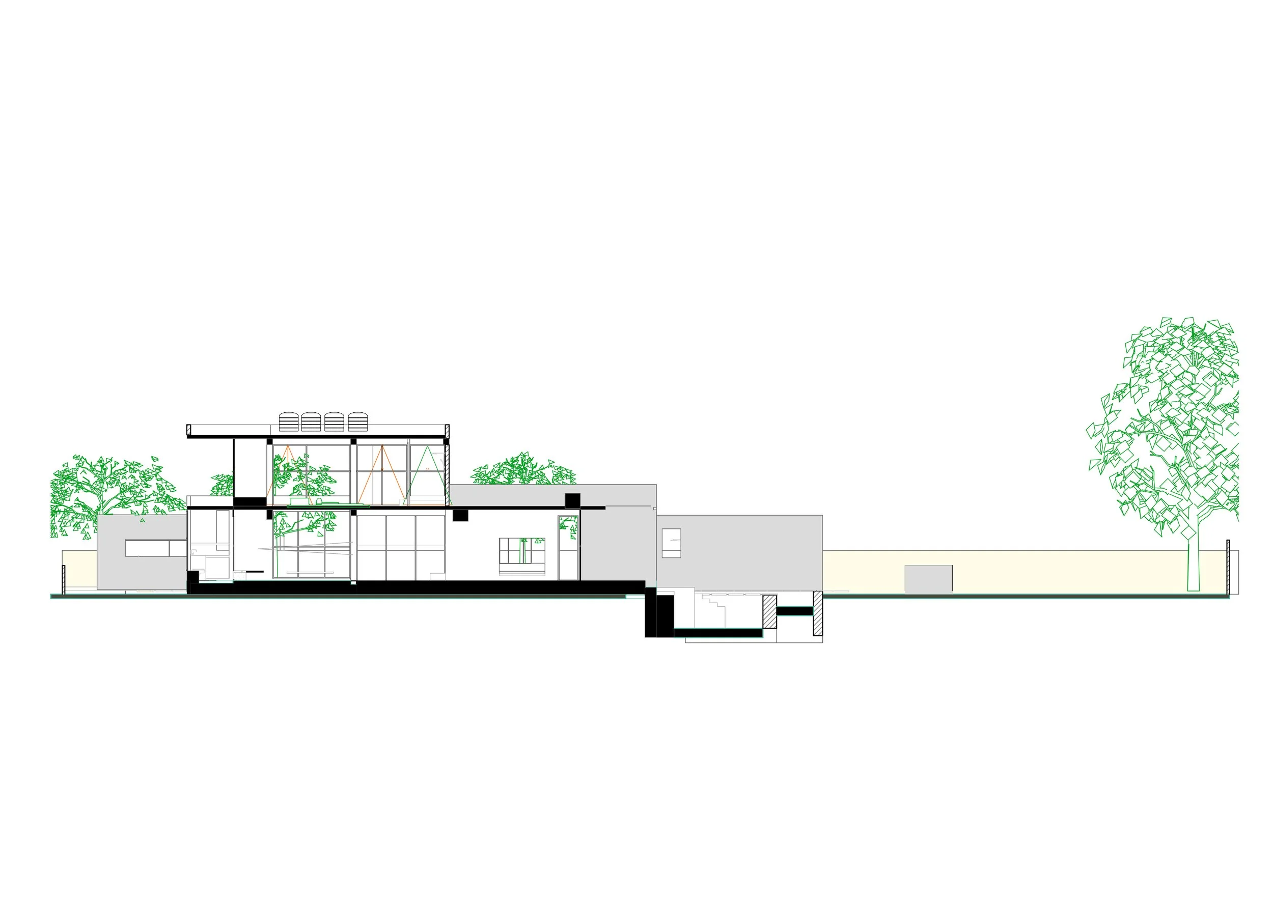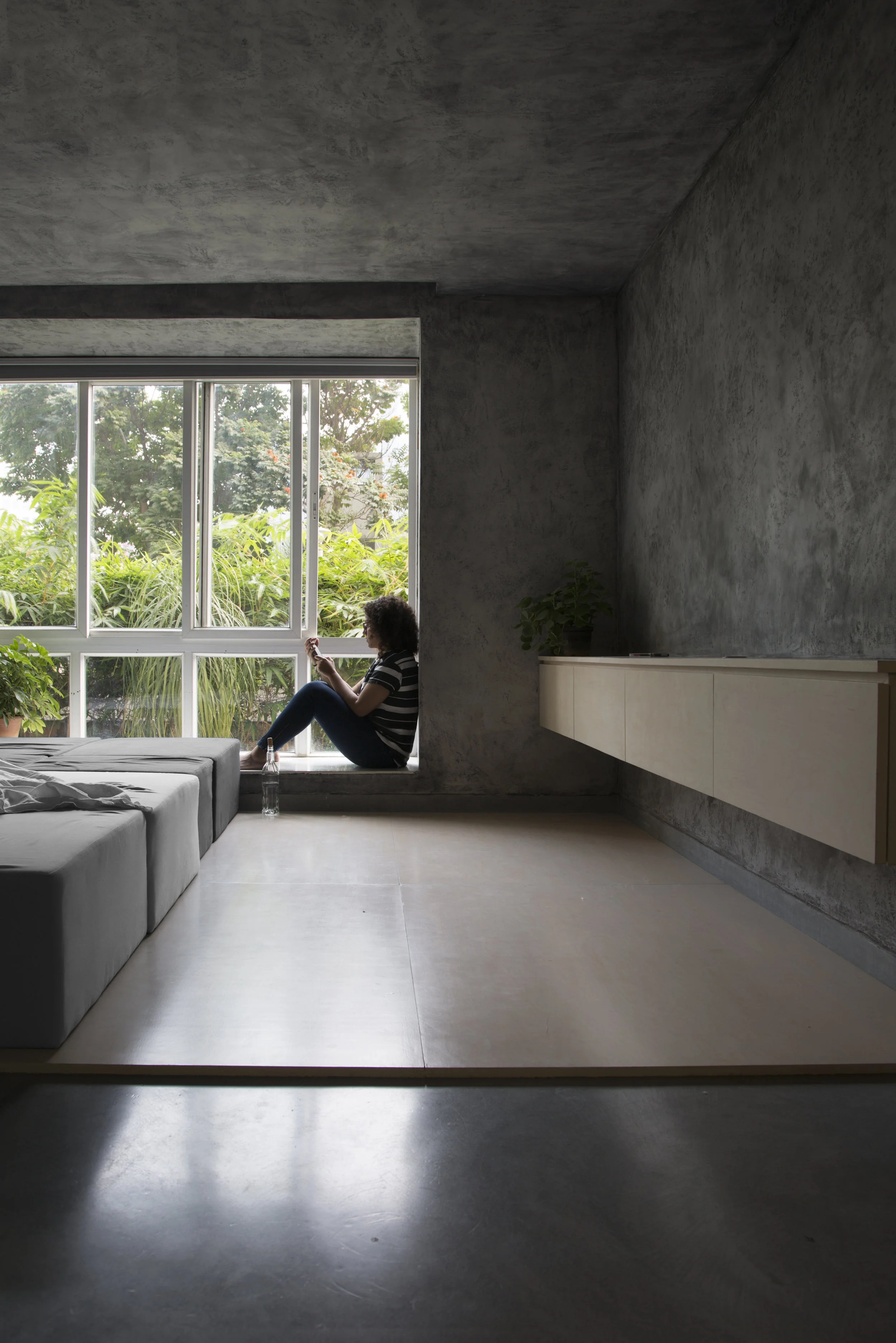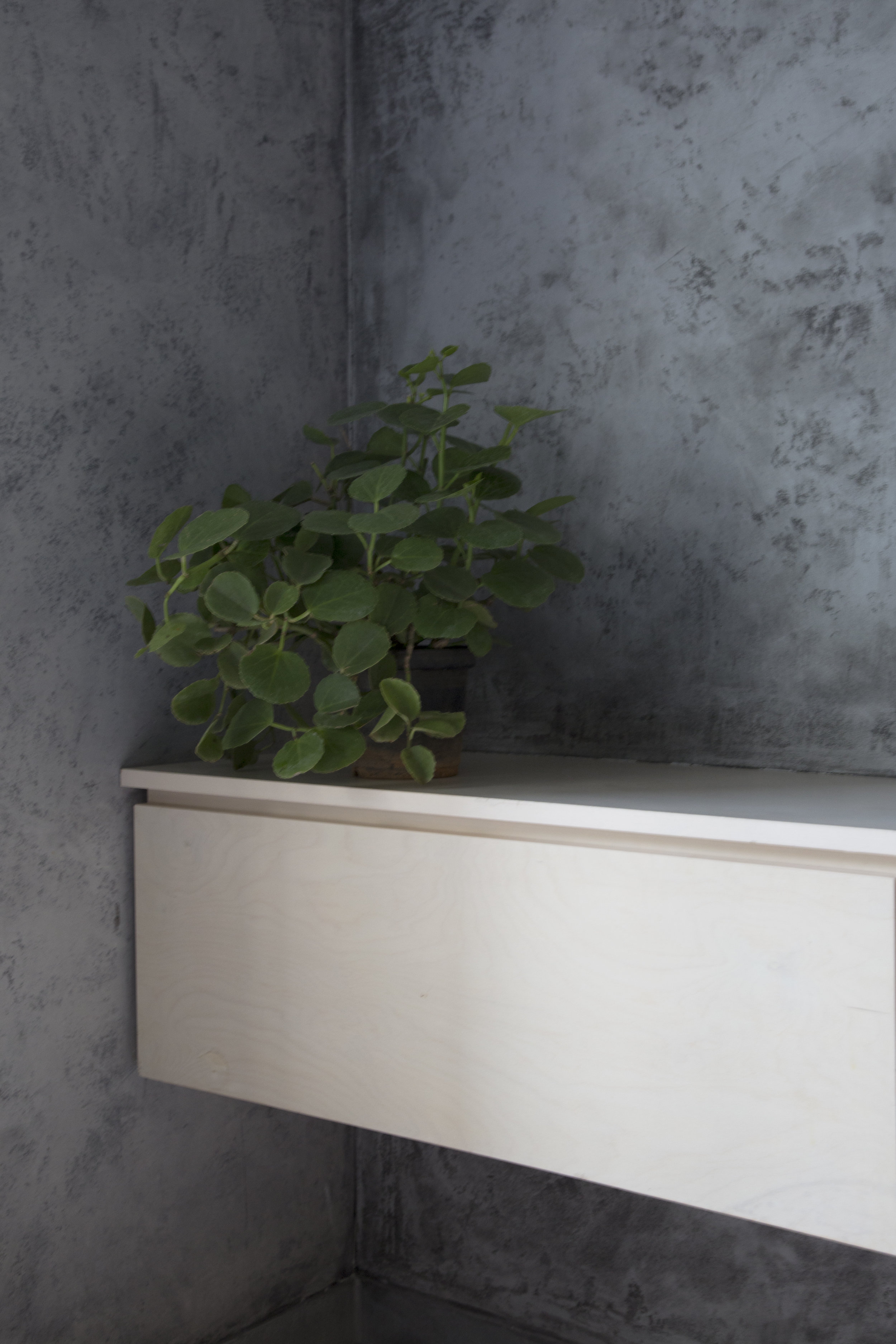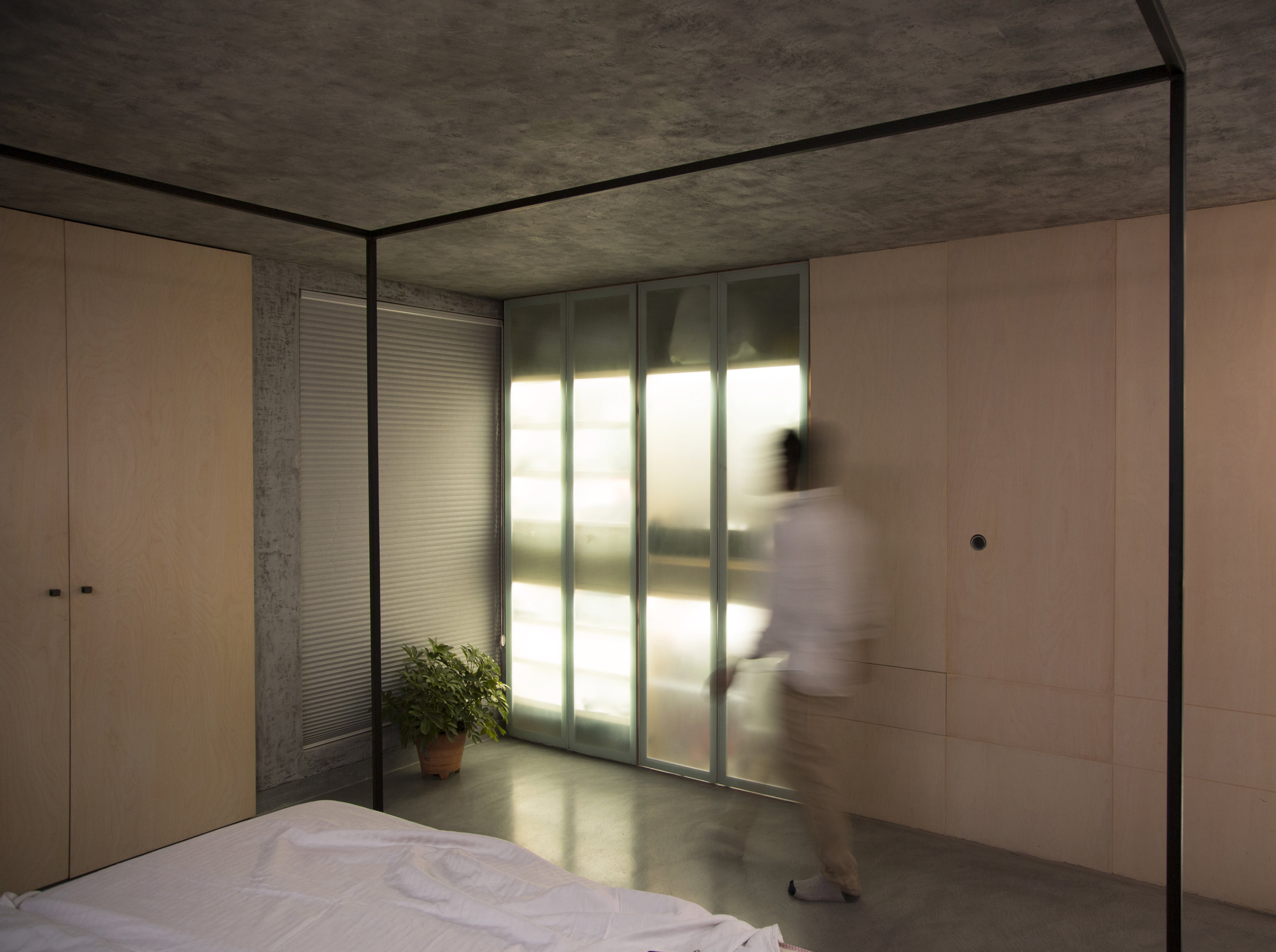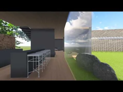
The essence the house sought to capture was the quiet presence of a person resting beneath the shade of a tree. This idea shaped every decision—from its muted grey-and-black interiors to the generous openings carved on all sides. These apertures invite constant breezes, allow effortless cross-ventilation, and continually pull one’s gaze outward toward the light.
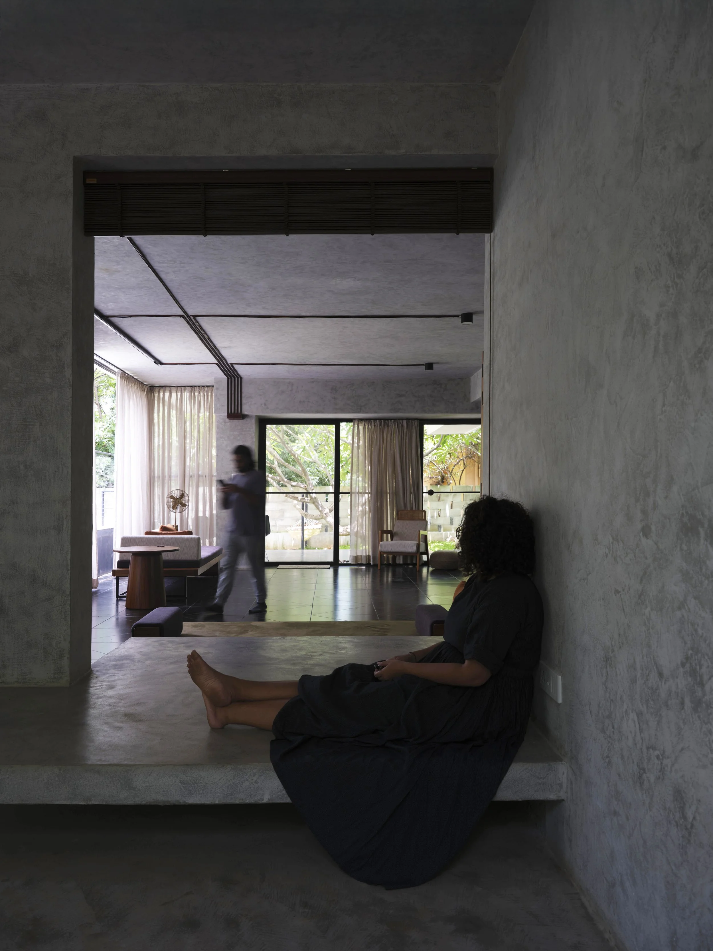
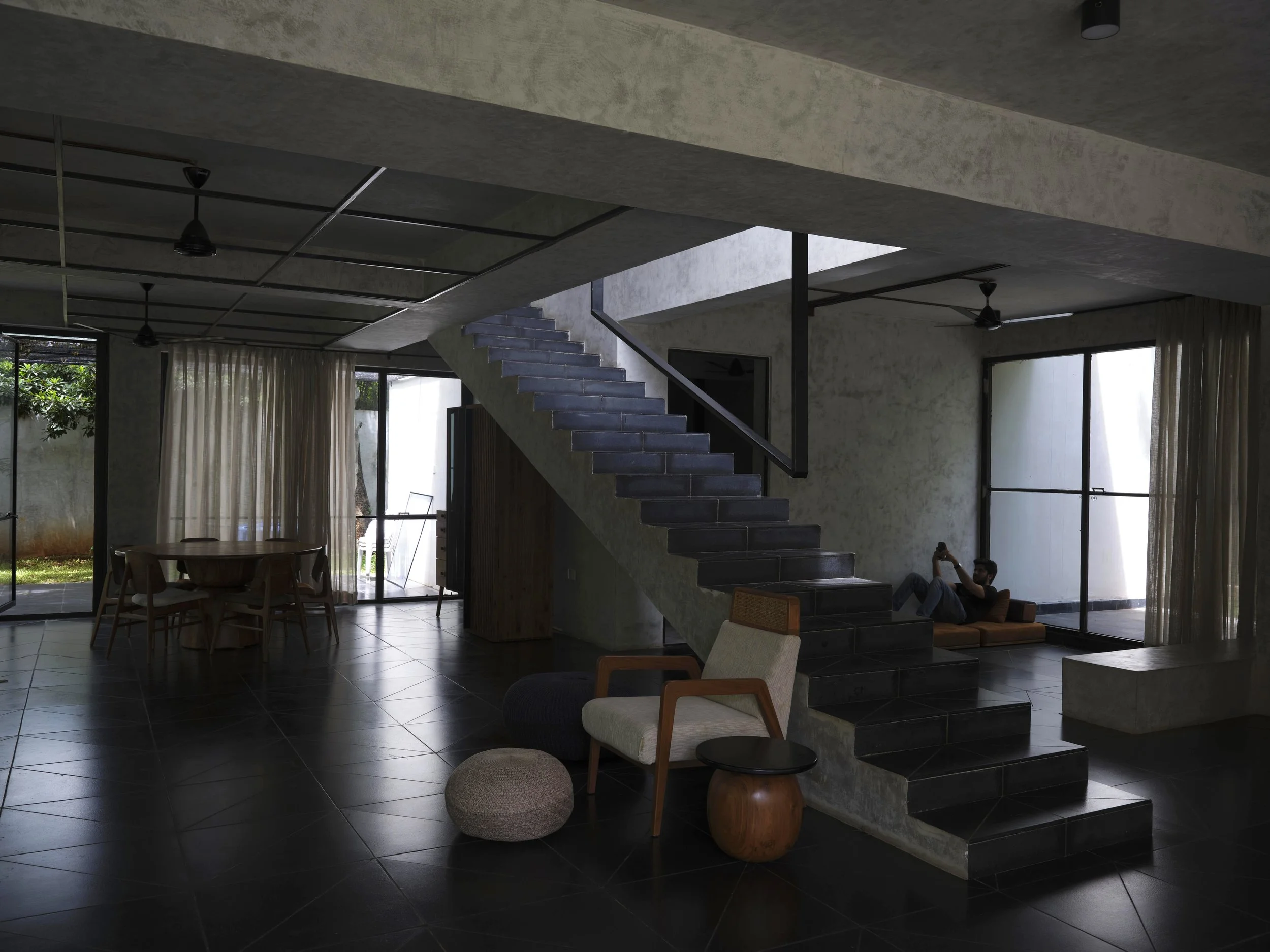
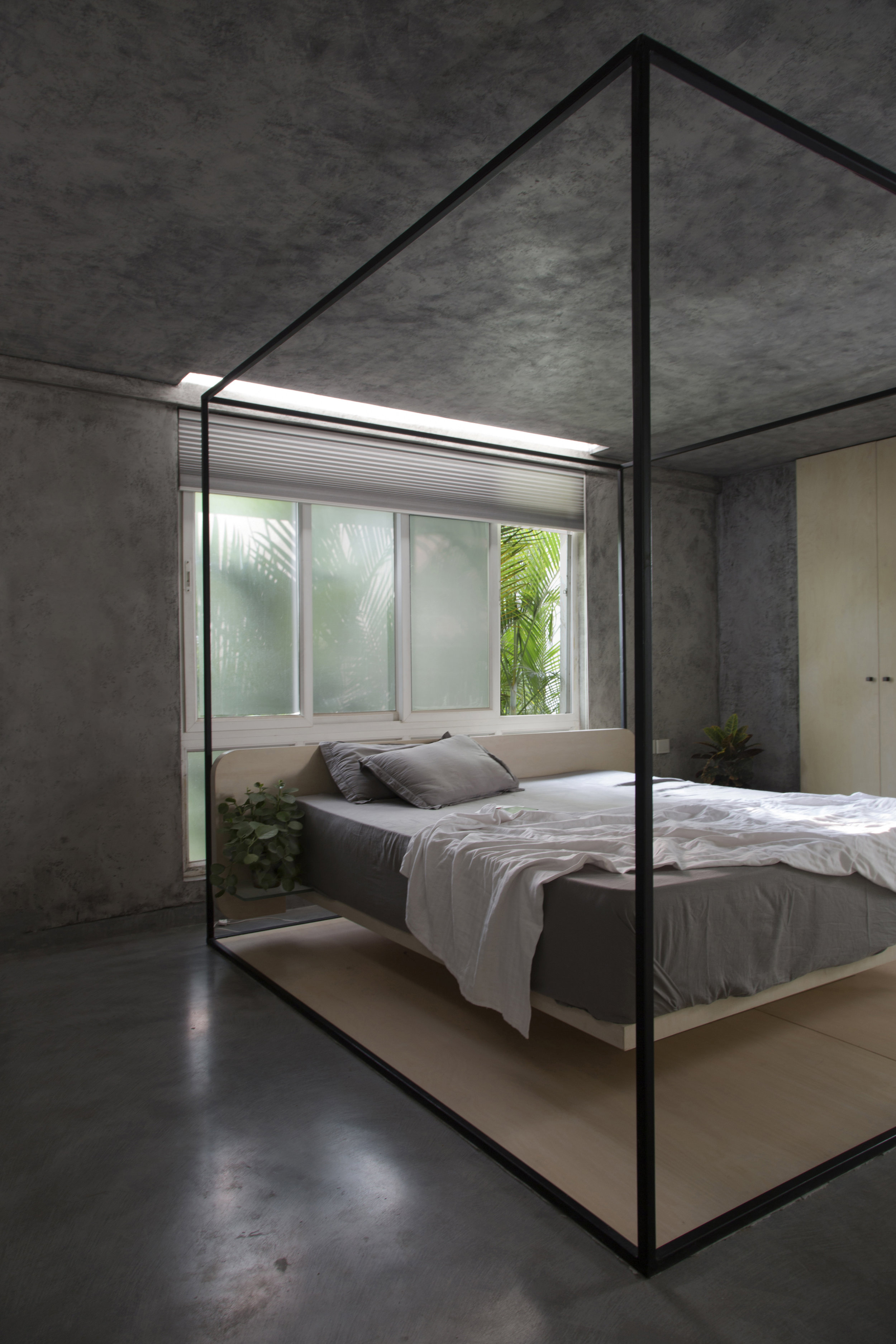
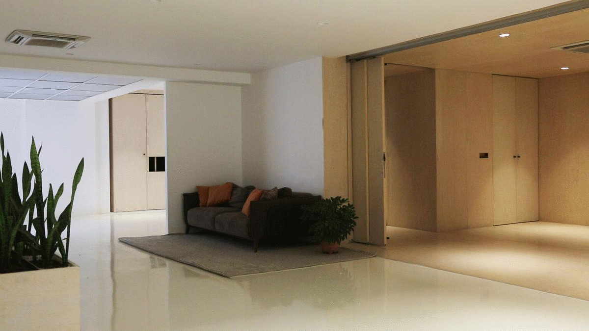
Because it was envisioned as a family weekend home, openness became a central priority. The plan dissolves boundaries, encouraging communal interaction rather than retreat. Even the bedrooms forgo permanent doors, reinforcing the intention that the house becomes a place of togetherness rather than isolation.
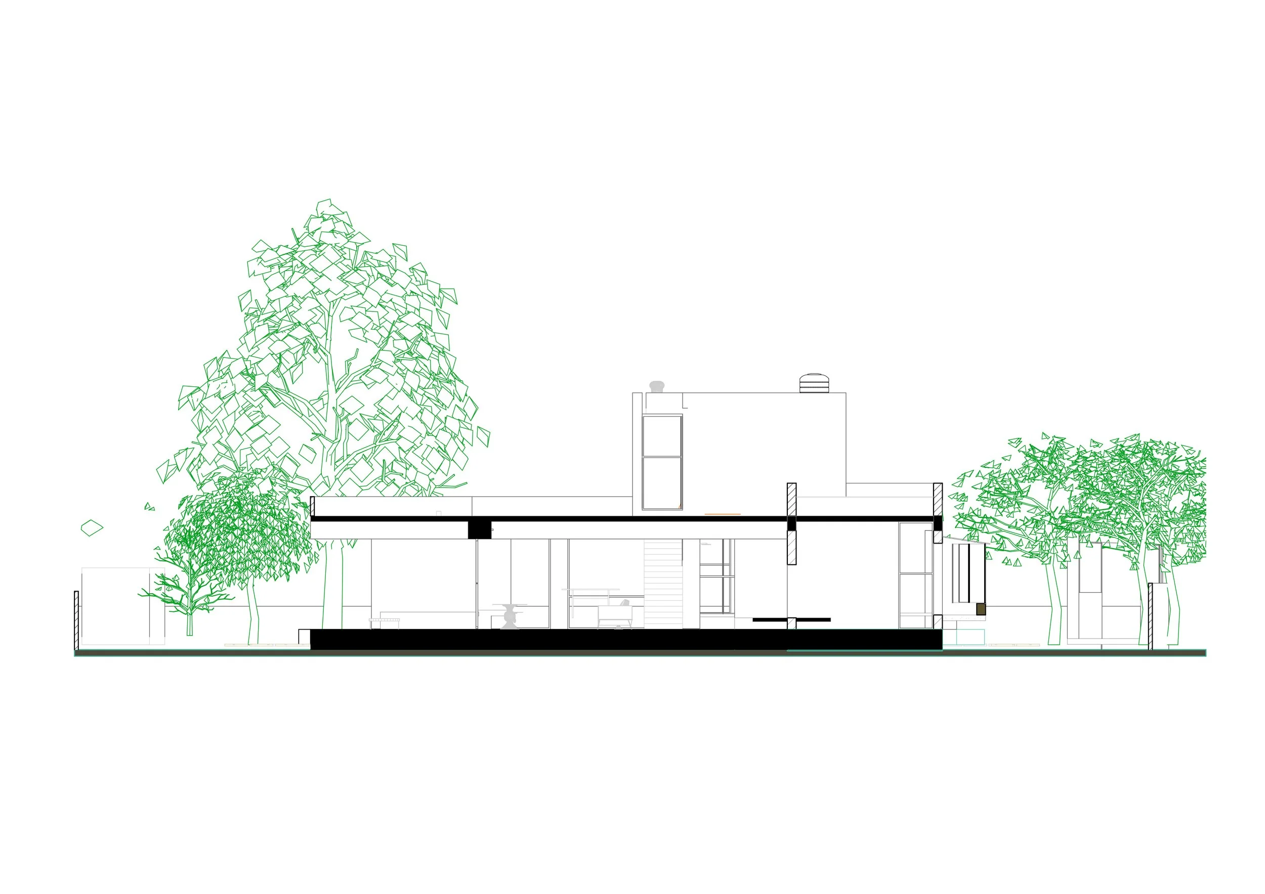
Light and shadow became the primary materials. The moving silhouettes cast by the trees, and the shifting sunlight that filters through the openings, create moments of stillness that animate the spaces throughout the day. The architecture is a quiet play between brightness and darkness, between enclosure and exposure.
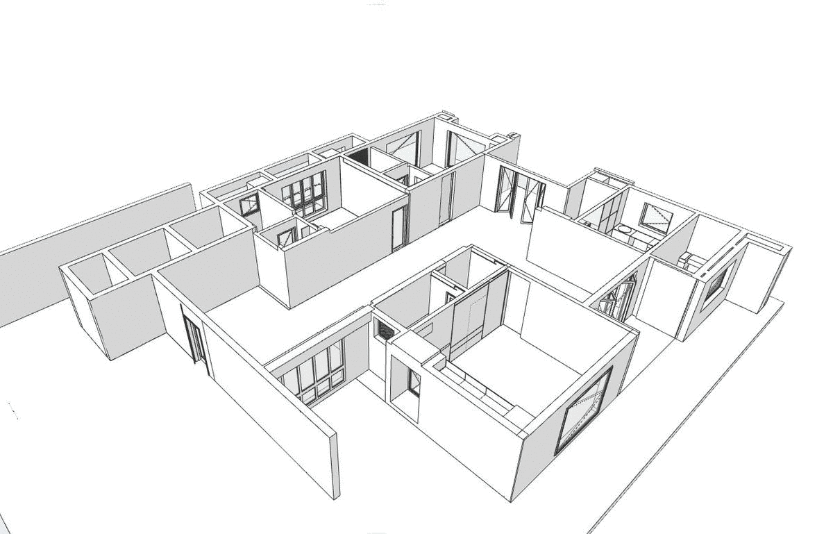
Every square foot of the house maintains a visual relationship with the sky. At the heart of the plan, a central staircase rises to the first floor beneath a slender slit skylight. This opening works double duty—as a dramatic light well during the day and as a night-flush system that draws warm air upward, enabling continual passive airflow.
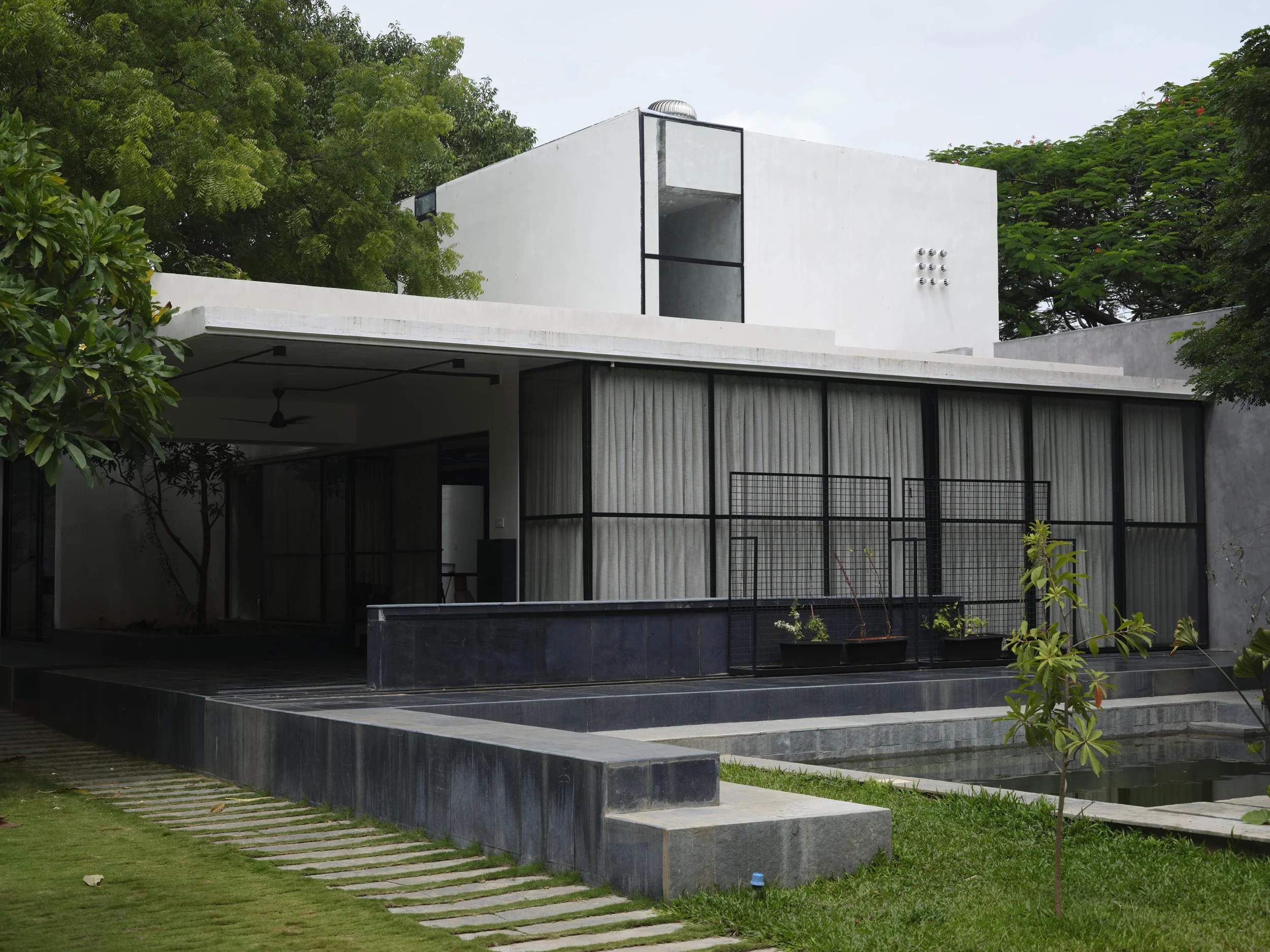
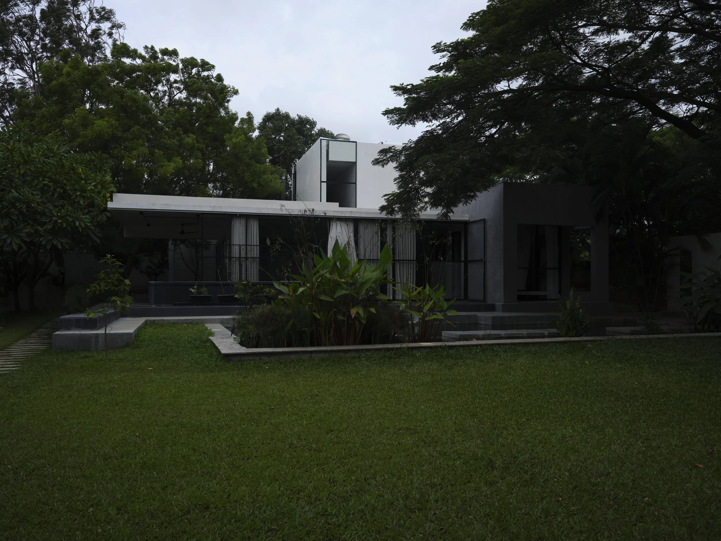
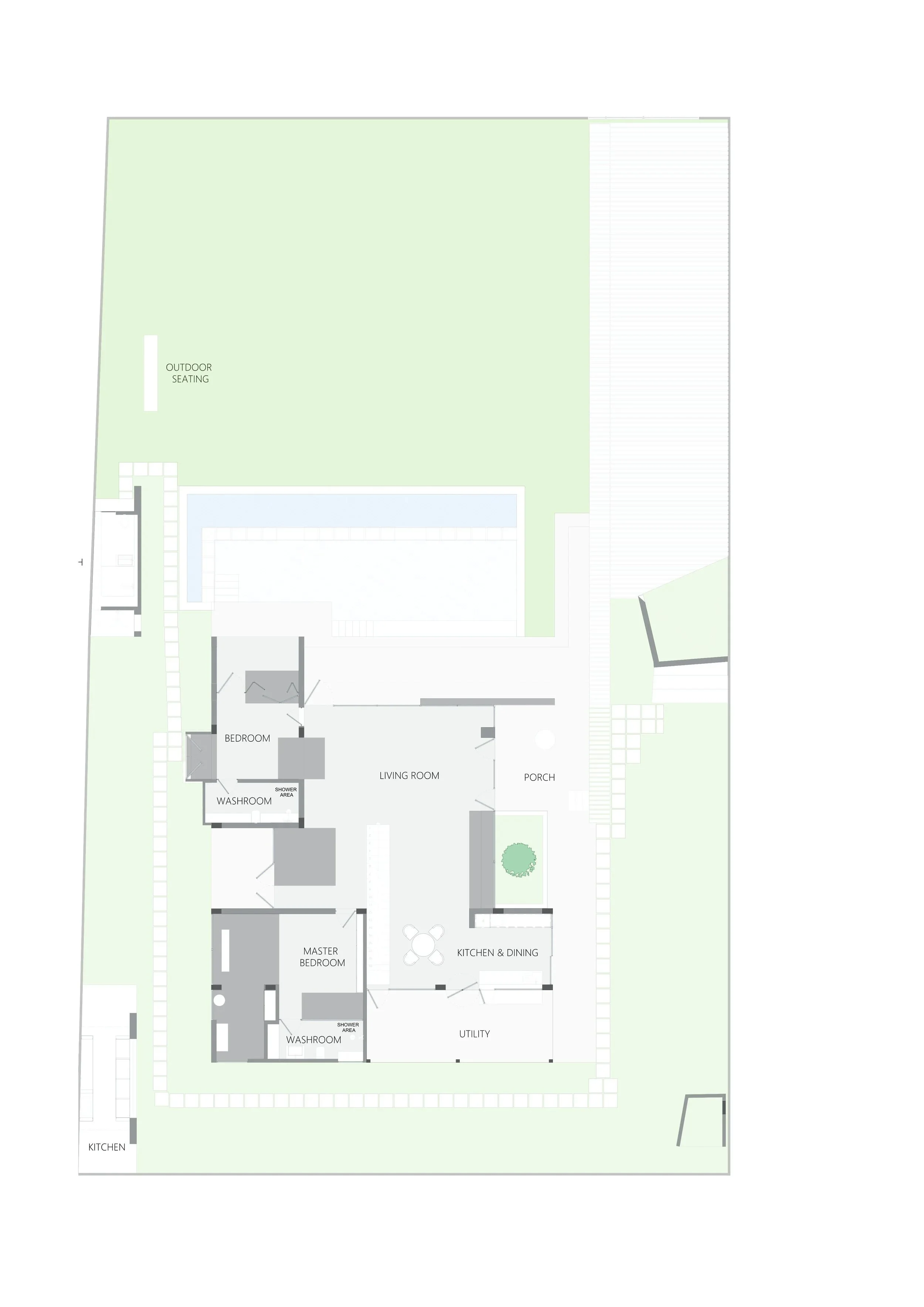
The site itself was blessed with a beautifully layered canopy of existing trees, carefully grown and curated over the years. Rather than imposing on this natural order, the house was nestled directly within the tree cover. Courtyards and cut-outs were shaped in response to the trees already standing, allowing the architecture to weave itself quietly into the landscape.
The surrounding terrain was left simple—gentle mounds guiding visitors toward the entrance. This subtle landform design lets the house feel as though it settles into the ground, rather than rising above it.
In the end, the architecture became a process of subtraction rather than addition. A recognition of presence through absence. As the project reminds us: I only know that “I am.” I don’t know what I am; I can only know what I am not.
“Ultimately, the design evolved as an act of subtraction rather than addition—a search for presence through restraint. The architecture emerges from what is removed, not what is imposed. As the project quietly suggests: I know only that I am. What I am is defined not by assertion, but by the boundaries of what I choose not to be.”
Client: Prajay Engineers Syndicate Ltd
Project Status: Completed
Project Type: Commercial
Budget: INR 20,00,000
Description:
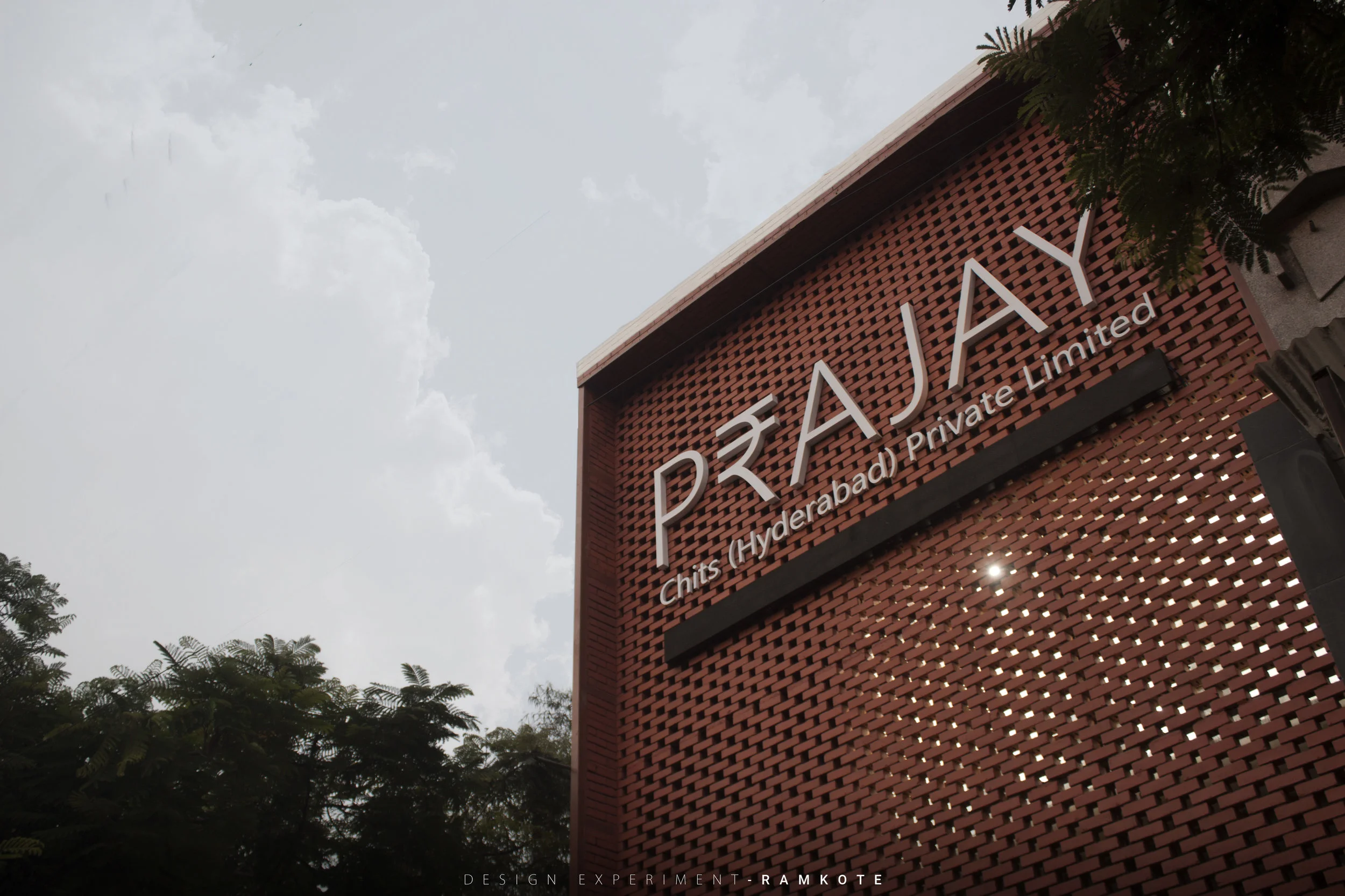
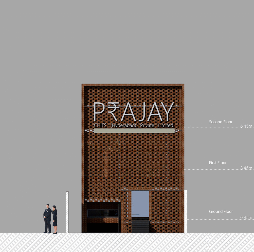
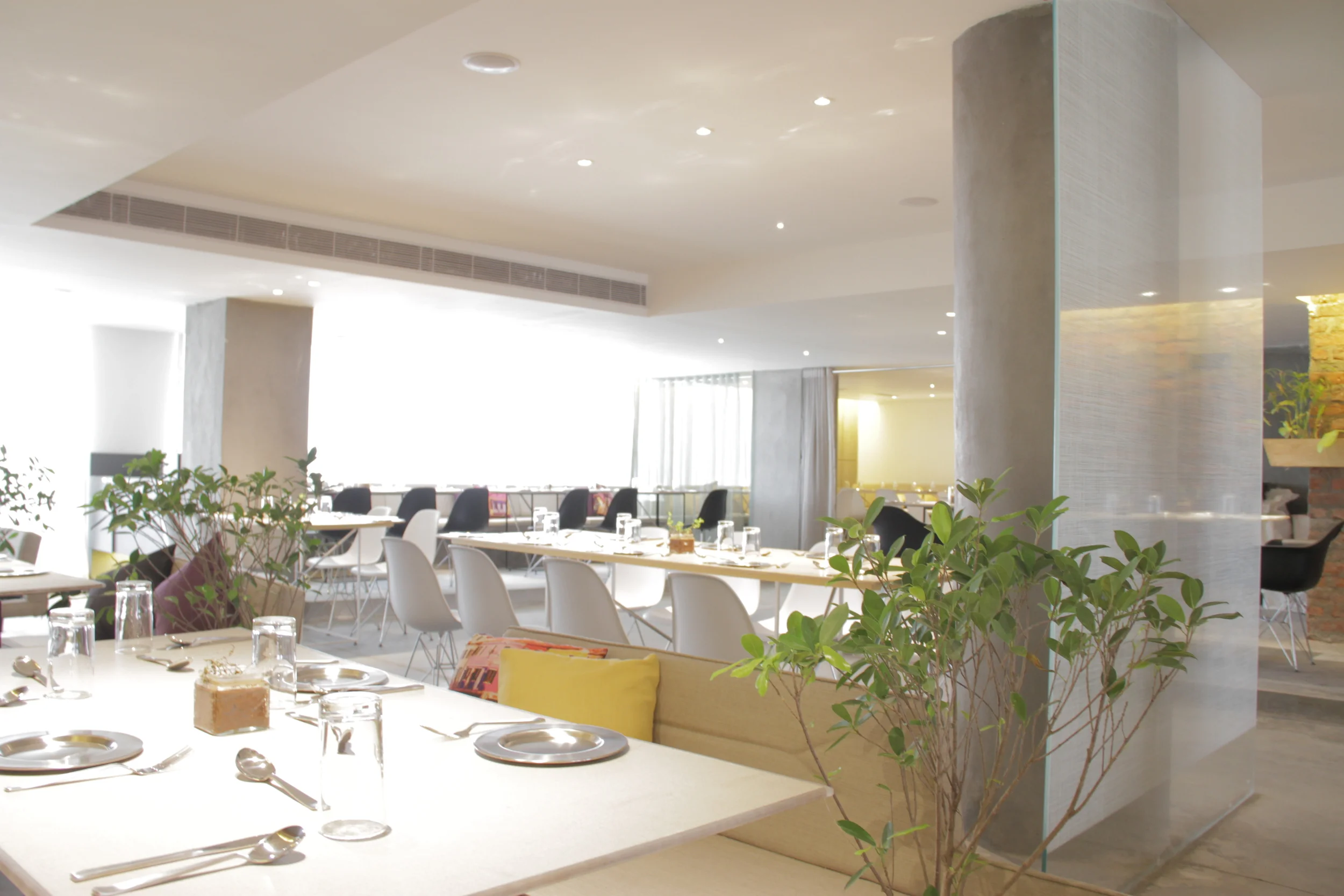
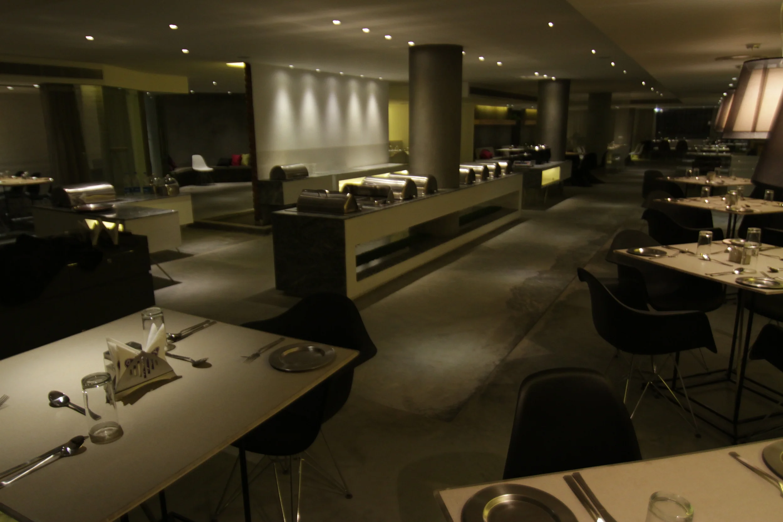
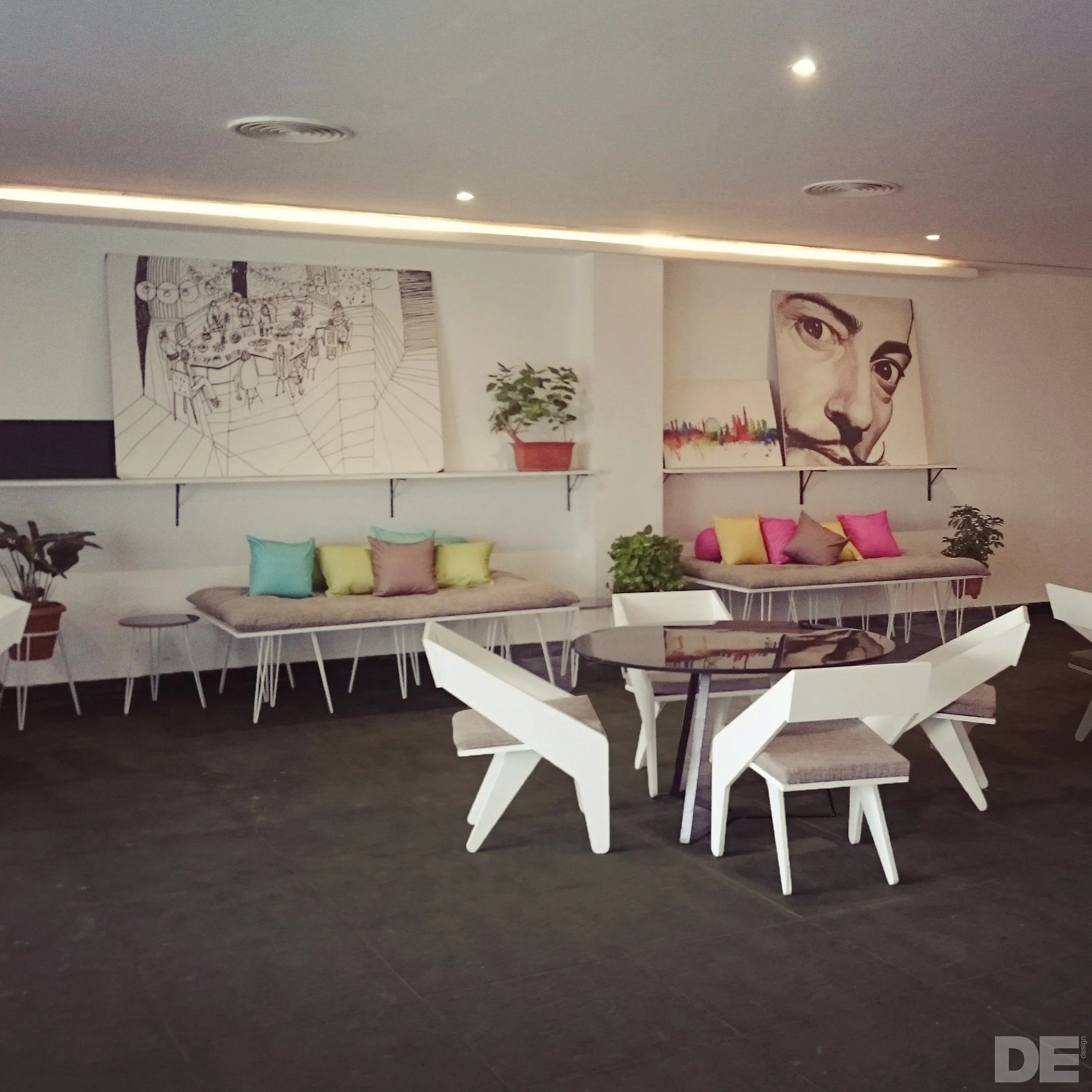
Intention and identity were the two challenges presented to design experiment When asked to renovate an old building for a chit funds office. The intention of the company was clear, to instill confidence in the chit funds offices' potential customers. The chit funds industry has been fraught with scandals, from owners shutting shop abruptly, to refusing to pay up to its customers, so the architects came up with a novel way to propagate trust amongst its patrons. A simple design intervention in terms of installing a large continuous scrolling LED strip, broadcasting how much the company paid out to its customers that week. The designers felt that, by increasing such evident transparency, it would be possible to earn the trust of its patrons.
One of the other undercurrent of this project was that The entire office needed to be designed and built in 45 days, so the designers chose to go with a design language that would try to stand out without disrespecting its surroundings, and that a brick facade would be detailed specifically to be rapidly constructed. The second task of creating an identity not only through its space but also through its graphic language and branding was handled by DE.
DE used this opportunity to create a unique blend of stability + forward thinking by combining the offices' facade with its modern branding. The interiors of the building combine environmental graphics of simple minimal quality with clean and crisp visual communication to emphasise on the company's forward thinking and transparent brand values.
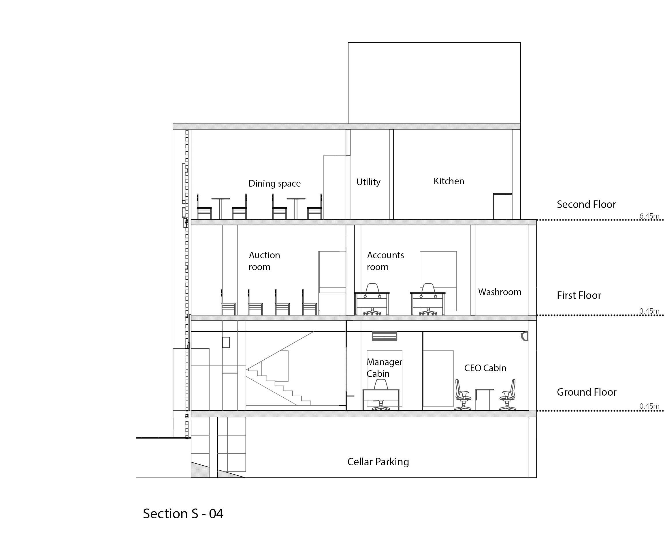
Ground Floor
First Floor
Project status : Completed
Project type : Residential
Description :
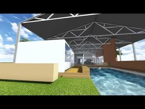
When is comes to space design, there are two things we are constantly chasing and accommodating for. More light and more plants. This project was no exception.
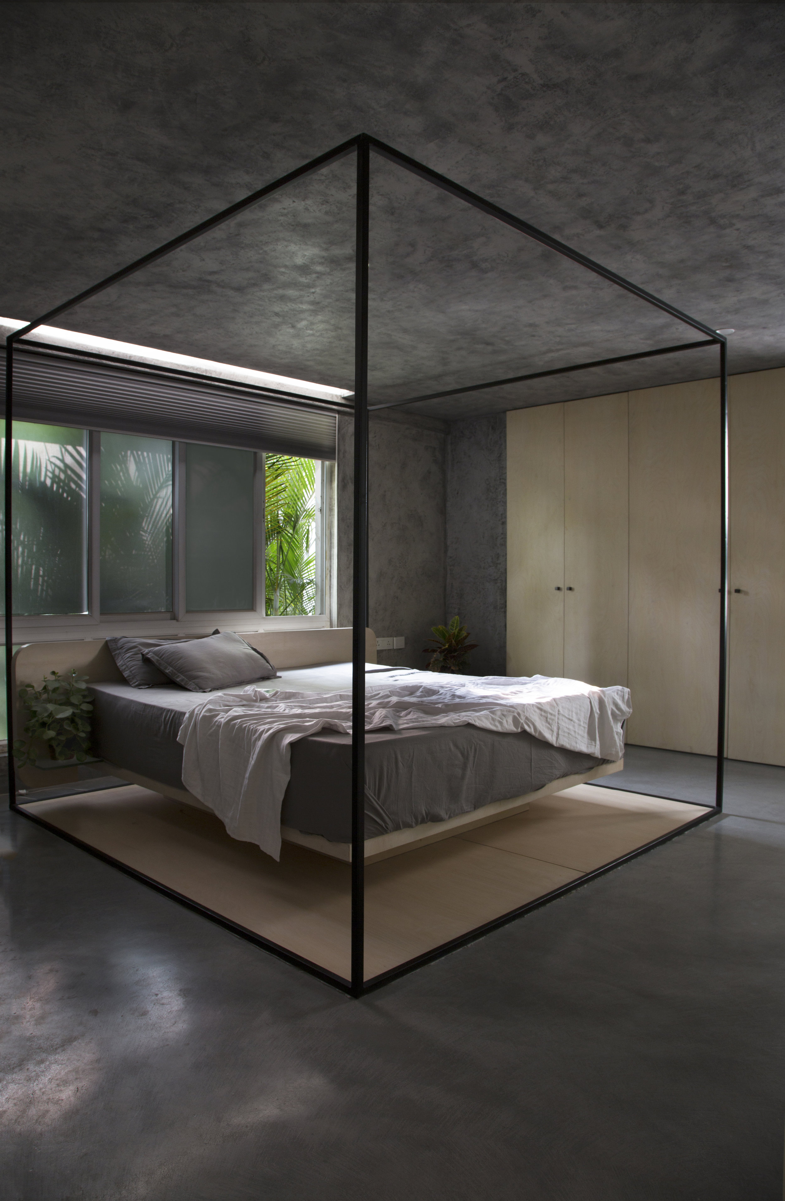
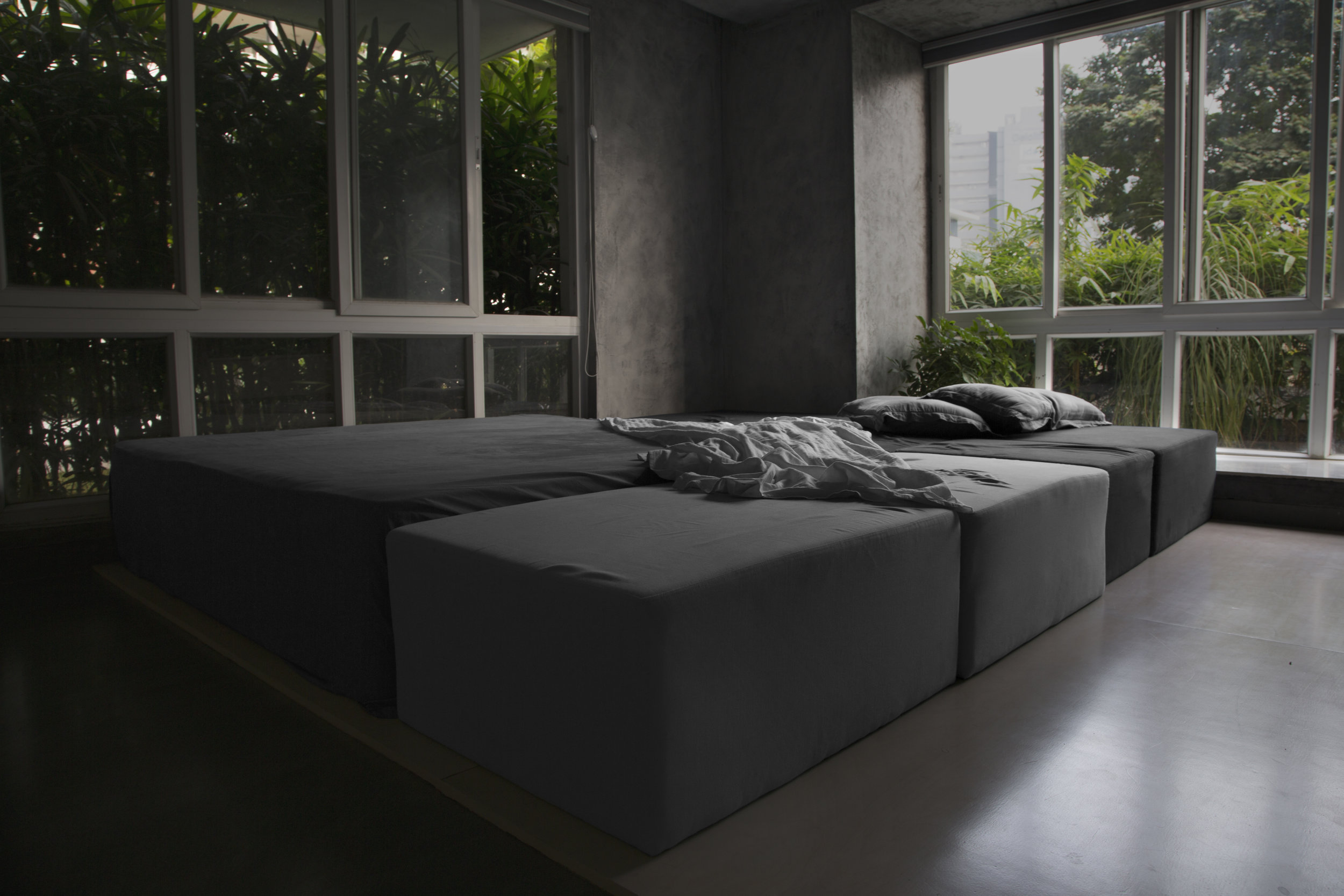
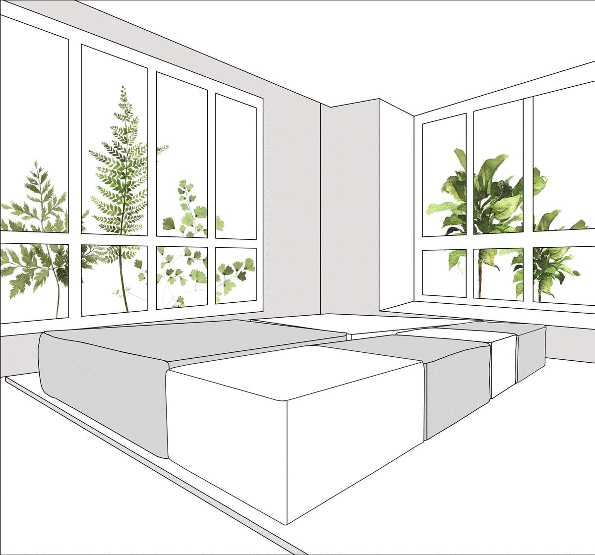
Our site was a balcony with beautiful foliage flooding in, attached to a narrow long living space.This space had to accommodate a bedroom, the original idea was to club the two spaces and make it one large separate room. While the room could be brilliant, it didn't feel fair to block all the light off for the rest of the floor.
So we intervened and suggested, that we breakdown the idea of what they wanted from a bedroom into its various functions and create a space that allows for these functions into free flowing zones, without being walled off. And this space with multiple zones, some hanging and some boxed off happened in place of one massive bedroom.
The entire space is zoned into - the parents lounge, bed, play zone, study and the bathroom.
The parents lounge is a small seating besides the large windows next to a small kitchenette, that allows for some morning coffee in the bright open spaces amongst the greenery.
The new room preserves the privacy of a bedroom, while allowing for a free and open space by elevating the bed above the eye level. The space that would usually have been occupied by the bed now has a small reading nook flowing into a play area. The play area is the common space between the parents and the child, intended to be spent as a bonding zone, it unifies the entire space by creating a bridge between the parents area and the child's area. The net serves as another layer for Dharma to explore and make use of.
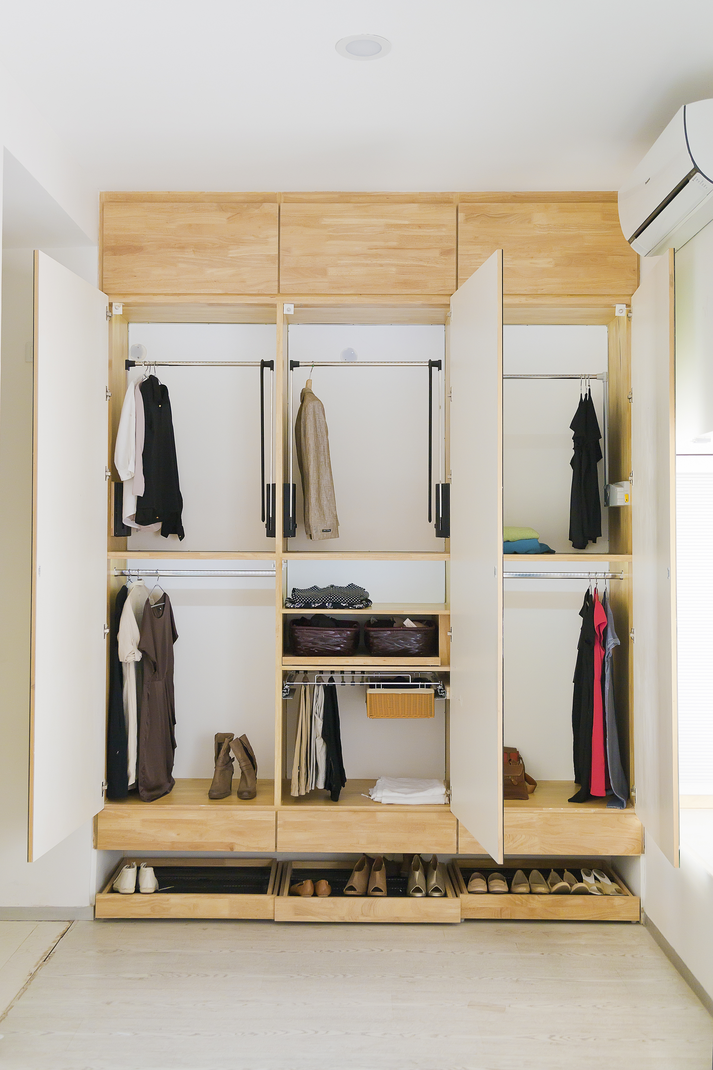
The only space that needed to be closed down completely was the wash and dressing room and so we have a separate block that houses the bathroom and the dressing. The bathroom being an all dark concrete finished space forming a bathtub into the structure itself.
The main door into the dress area is also the door of the wardrobe. So when the dressing door is closed, the wardrobe opens up. Considering this is being an enclosed space with its own slab, all the rooms services are placed above this block.
Finally, the study is situated such that the parents can monitor without intruding, and allow for tuitions etc to happen in a semi common space.
Project Status: Completed
Project Type: Residential
Description:
Located in one of the most population dense cities in India, Meenakshi B101, is a mid-size 3 Bedroom apartment for a young couple as their first home together.
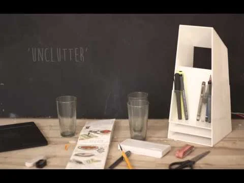
The apartment is designed to bring forth a calm and relaxed atmosphere, that allows the mind to wander in it without any element demanding for attention. Designed to be the antithesis of a city built on distractions, the apartment declutters the environment it creates, by removing anything and everything that is usually an element of decoration by replacing it with plain white surfaces and a few warm wooden elements punctuated by greenery to create an environment that tends to remove itself soon after the initial pleasant surprise of walking into an empty space.
The apartment is designed to bring in, and make use of, as much natural light as it possibly can, reflecting off its clean white walls and floors to fill up the room with the hues and shades of the day outside.
Decluttering usually involves a certain level of compromise, but the B101, had been designed to suit the needs of a family in the transition phase of adding a new member, while slowly growing out of the hard party lifestyle that comes with young high-income hardworking couples in a metropolis.
The main door of the apartment is a 200kg specially engineered door that can accommodate a large storage while also being simple enough to operate without any special considerations, this massive door greets its visitors by smoothly moving itself out of the way after biometric verifications to present a space that doesn’t require anymore storage.
A guest room can be added or changed into home theatre depending on the requirement at hand, the additional bedroom is suited to be converted into a child's bedroom upon requirement and a balcony that can be converted into a cocktail station, the entire apartment is designed with flexible spaces that cater to the needs of the clients varied lifestyles.
The core of the apartment is the master bedroom, which, unlike the living spaces is not designed for the mind to wander, but to be cut off, to create a sense of retreat, and mark the end of a more active day. Carefully designed to maximise the amount of space available by removing walls between the bedrooms and the bathrooms and replacing them with storage, the amount of space has been enhanced while simultaneously making the whole space feel cosier than the rest.
This approach of decluttering extends into every aspect of the apartment, from removing any visible water heating devices in the bathrooms, to tidying up the thresholds given to the doors, to custom designing furniture that is designed to blend in (the swing is made of a transparent composite to mesh into the background).
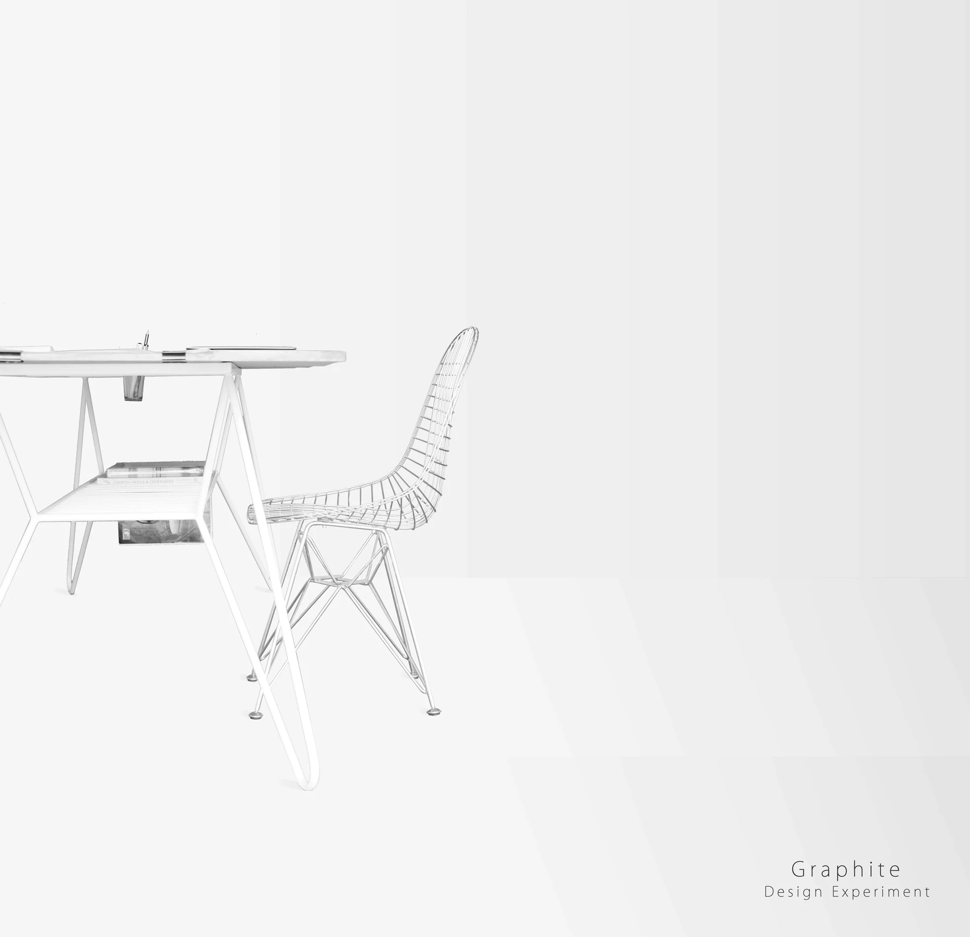
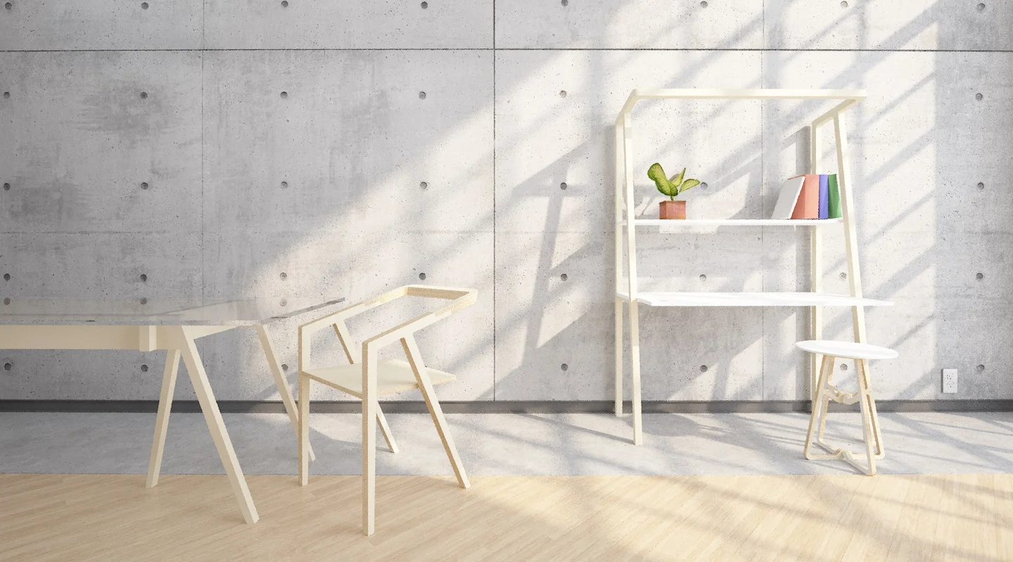
Graphite is a modern work table designed to accommodate 6 to 8 people as a work desk and also a conference table. Packing more storage than just a table top the table uses a special concreting technique that keeps the weight of the table to a minimum while still creating the concrete aesthetic. The result is a light and movable table, which can fit in any dynamic office.
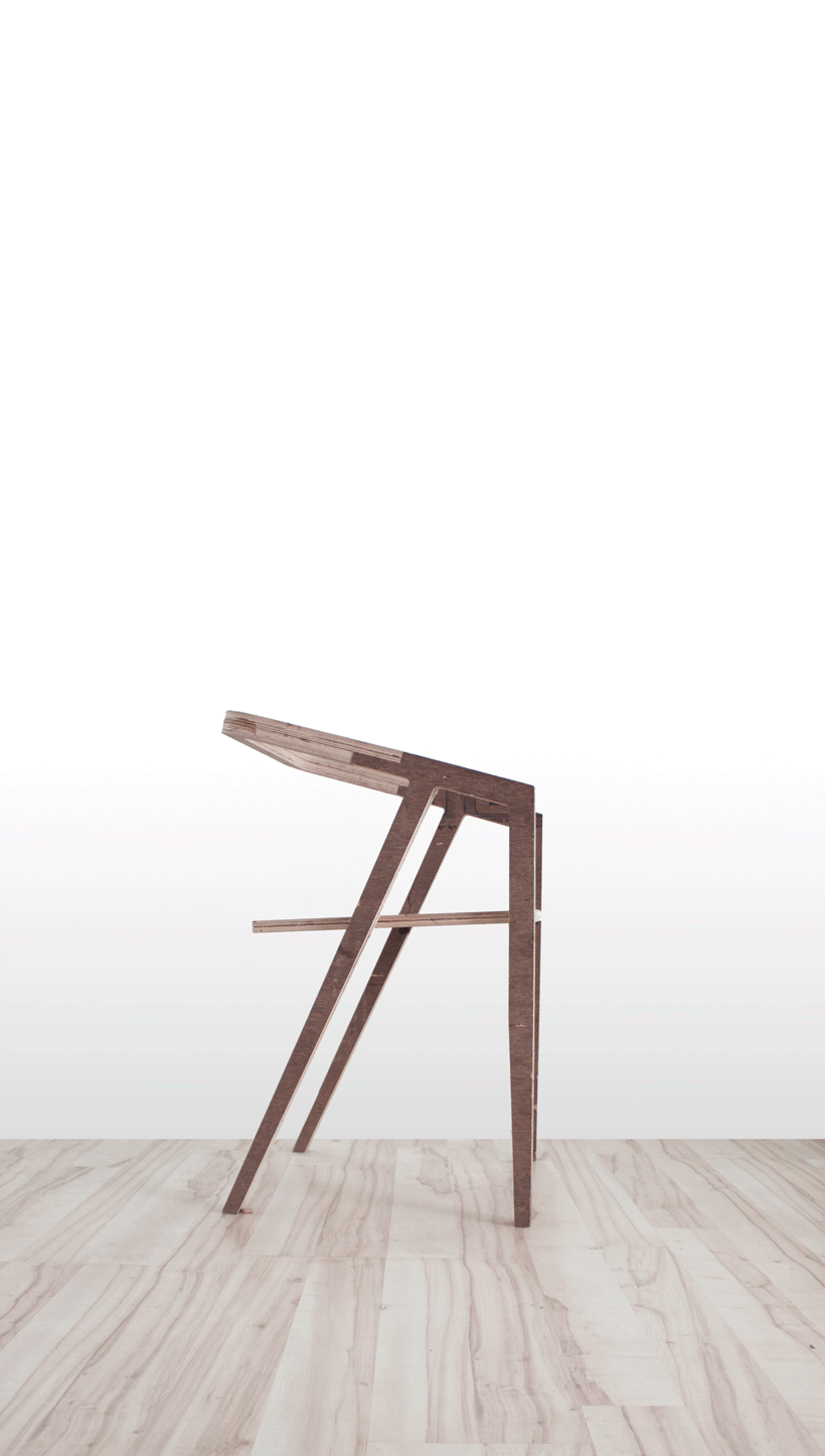
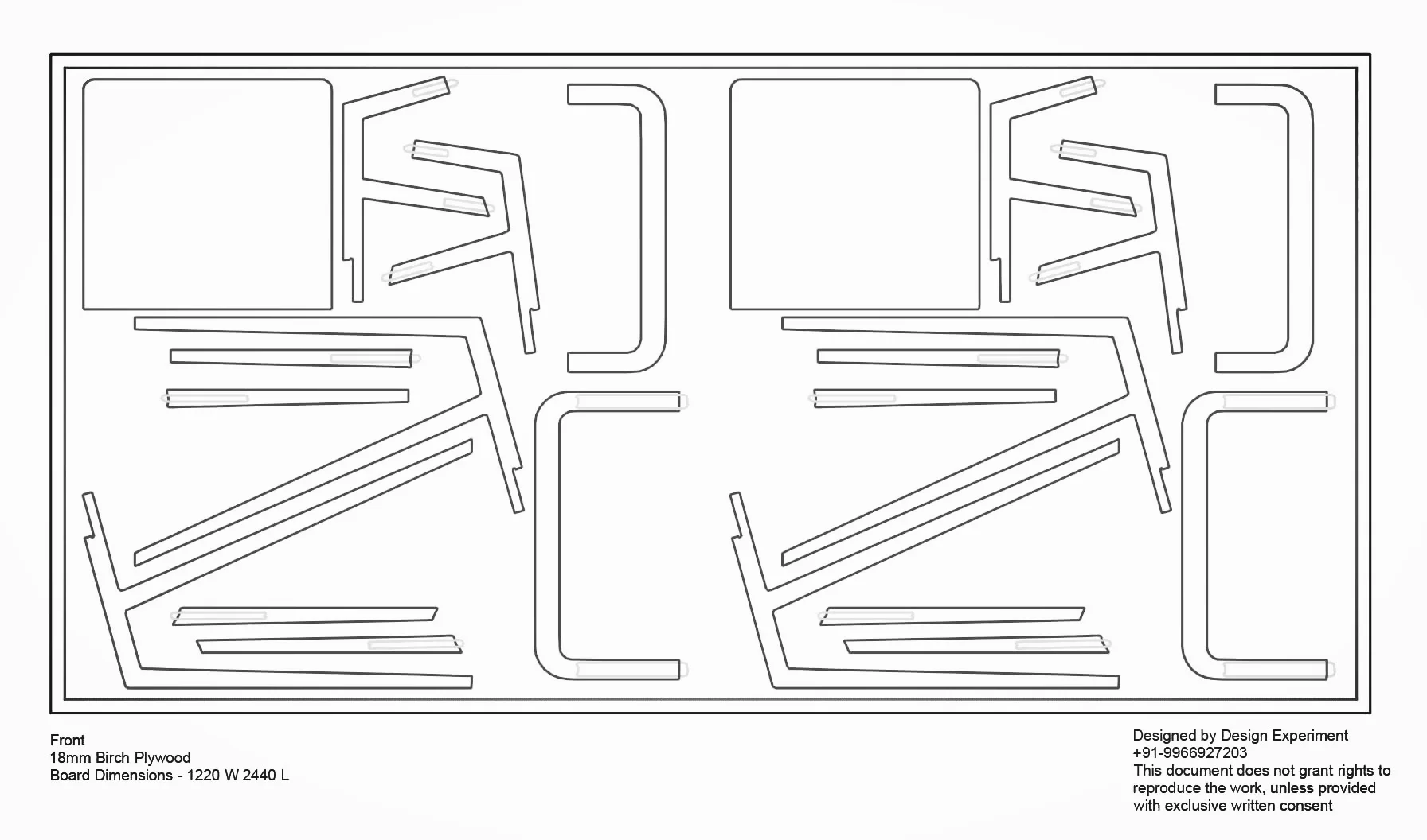
Starting out as an attempt to design a simple, elegant and easy to manufacture chair, the they said chair adopts its form from a very contemporary aesthetic and ties it to a simple and elegant manufacturing process.
The chair can be manufactured just about anywhere in the word because of its CNC based manufacturing technique, and can be built by pretty much anyone without any experience in building furniture.
The They Said chair stands for everything that its inspirations don't stand for - simple manufacturing, open source, skill less assembly and most importantly wide reaching beauty.
Client: Sanjay Shah
Project Status: Completed
Project Type: Commercial
Budget:
Description:
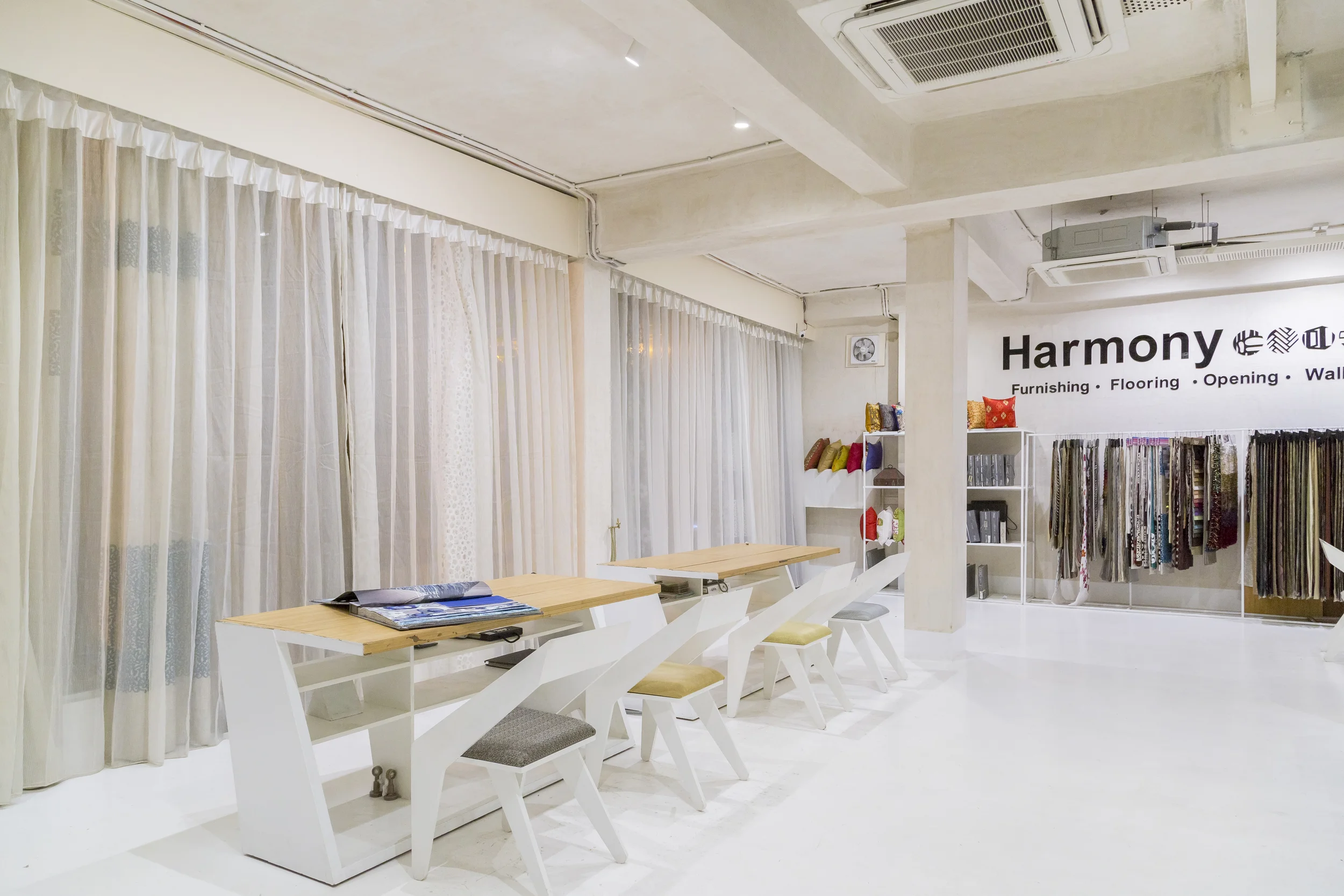
An exercise in both space design and branding, this space is all about the the products it hosts and the stories they tell.
The space itself plays an empty canvas that dissolves into the background showcasing Harmony's wide array of products. A philosophy that was extended into the overall branding as well.
The building was redesigned after a rather tragic fire accident, so the “all white” as a concept made both practical and psychological sense to us, to mark a new beginning, a fresh start. The ceiling however, was left exposed/rough around the edges to show its rugged strength and imperfect beauty the way the accident left it. It had to be subtle but present, to talk to its people of its resilience.
The only ornamentation in this space, yet again were empty walls and pockets of green, to rest your eyes when overwhelmed by choice.
Low budget projects, provide us with some very unique challenges. Which often times play out well with us, because of our “wanting to experiment and explore nag”, provided the client is with you on the journey. And in this case we couldn't have asked for more. In Spite of the ups and downs and the usual bickering (that’s bound to happen when two passionate entities come together) It’s been a very rewarding journey and a very satisfying end result.
#403, Prajay Corporate House, Opp Shopper Stop, Begumpet - 500016, Hyderabad - Telangana.